The secret to a timeline chart in Excel is the data.
Emily writes asking “How can I make an Excel chart with dates on the X axis with a proper time scale – even if the dates aren’t regular? “
We could not understand Emily’s question until we asked for more details. Making a date based chart is quite easy in Excel. It turns out Emily had tried making a date based chart years ago and given up. It’s one of those things that Office used to promise but was difficult. Now it’s quite easy.
Let’s start with a regular chart with nice evenly spaced dates. In this case, monthly.

Select both columns of data then Insert | Chart | Line or whatever chart you think appropriate.

Excel 2013 makes chart selection a lot easier with a proper gallery and live preview.

It’s quite a basic look but the important elements are all there. You can tinker from there to make the chart look better.
Irregular Dates
If only all dates were evenly spaced. Often they are not. Either data is missing or, as in this example, the events aren’t regularly spaced.
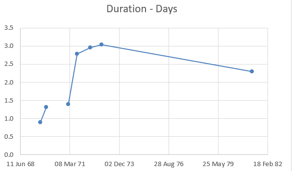
We added the first shuttle mission (Launch date and flight duration) so the gap in the timeline is realllllly obvious .
Selecting the B and C columns to make a default chart like this:
Notice that Excel has arranged the horizontal axis into a timeline automatically. There’s a long gap between the last two data points (due to the gap between Apollo and Shuttle programs).
Sidenote: modern Excel copes with missing data points in a better way. Notice the gap around 1970 where Apollo 13 has no landing/duration data. Orginally Excel would have ignored the missing data and joined the line between the two data points. Now it shows there’s something missing from the chart info.
To adjust the timeline, right-click the axis and choose ‘Format Axis’. Here’s how it looks in Excel 365 and below that in an older Excel.
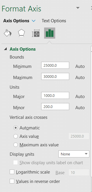

Under ‘Axis Type’ you can force Excel to consider the data text or date but if Excel has guessed wrong then there’s usually a problem with the source data.
The top axis options can be adjusted – for example you could change the scale to start 1 Jan 1969 and end 31 Dec 1981 or change the unit settings so there’s not so many labels along the axis.
Don’t be afraid to tinker with the chart settings and formatting because Undo is your friend and constant companion.
Check the data
The trick isn’t in the chart, it’s in the data. We nerds call it normalizing data, normal humans call it making the dates all the same type and look.
Before making a date based chart, look carefully at the date data. Is it all in Excel date format or as text? Make sure all the dates are in the format Excel recognizes as dates – not text.
That was Emily’s main problem – some of the ‘date’ cells were actually text so Excel didn’t know how to format the axis. Once that was fixed, the chart appeared without fuss.
It makes things a lot easier if the source dates are in the format you need for the chart. For example, the original Apollo data had landing date and time down to the second. To make the chart easier to make and manipulate, we reformatted the column into date only.
See Also
- Excel Online – changing date format
- Dynamic Date Charts
- Sparklines in Excel 2010
- Red shirt analysis using Powerpoint and Excel