Before you make an Excel chart, check the rows and columns you’ll base it on.
A lot of chart problems are caused by incomplete or badly formatted data. Excel is smart at turning numbers into charts but it’ll get confused easily.
Have a look at this simple table imported from a web page.

Looks OK but see what happens when you try to make a chart.

Ouch … only three states are shown, values have become the chart title!
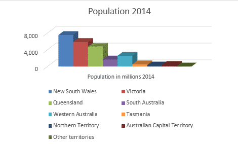
The problem is the data, not Excel. Those population numbers aren’t numbers at all. They were copied from a web page which Excel considered to be text because there were spaces, not commas, for the thousands. There were other anomalies that’s we fixed to make this table:

And this chart;