Excel’s Sparklines have a good range of options for highlighting high and low values, text or calculated overlays, changing axis and handling blank or zero values.
Sparklines are in Excel for Windows and Mac. Excel Mobile (iPhone, iPad, Android) shows existing Sparklines made elsewhere but they can’t be changed, only resized or deleted.
Even the first Sparklines back in Excel 2010 was well-developed. Little has changed in Sparklines in the decade since and that’s a tribute to the original development team at Microsoft.

Showing data points
On the Sparkline ribbon you can control the appearance of various data points on the graph line.
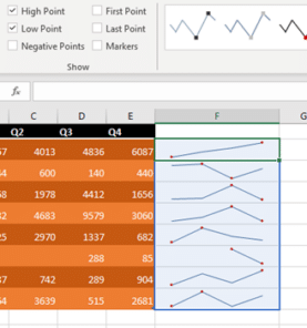
Select a Line Sparkline in the worksheet, go to Sparkline Tools | Design | Show. As you can see different types of data points are available
- High Point
- Low Point
- Negative Point
- First Point
- Last Point
- Markers (all data points)
If none of the options are selected to Show, then you will have just plain Line Sparkline.
Edit Sparkline and Marker Color
If you like to change the Sparkline color then select the required Sparkline in the report, go to Sparkline Tools | Design | Style | Sparkline Color. Select required color and it will be applied to the selected Sparkline. Suppose in a group you want to change the color of just one Sparkline then ungroup it first and then change the color of that particular Sparkline.

High, Low, First and Last colors
You can also change the marker colors in the Sparkline. For this again select the required Sparkline, go to Sparkline Tools | Design | Style | Marker Color.
Here you can edit the color of each data point separately or select to change the color of Markers which will transform the color of all the data points, if you have chosen to show Markers in your Sparkline.
The High, Low, First and Last markers can have individual colors assigned to them.
Negative (below Zero) data points can also get a special color.
As you can see in the below screenshot the Sparkline color is changed to red and the marker color for highpoint is changed to red for another Sparkline.

Sparklines as a background
Sparklines don’t fill a cell in the usual way. They are a cell background which can have other cell contents included too. In other words, a sparkline normally appears in an empty cell near the source data, but it doesn’t have to.
For one of the rows of data I’ve inserted a Line Sparkline in the column “Qtr 4” itself. As background in that particular cell.

Insert Sparklines as background by selecting a filled cell as the Location where the Sparkline is to be placed. Excel won’t overwrite the target cell.
Text with Sparkline
Any Sparkline cell can include text as a background, just add the text into the cell as usual. Like this warning not to take the figures as final.
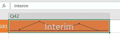
Change the font color to something less obvious.
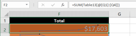
Another option would be to put the total or average into the Sparkline cell.
If screen space is an issue, this is a way to get more detail into the available window.
The Sparklines trap
Sparklines look cool but there’s a trap for new players. Check out this simple table with column sparklines but different settings.

At a quick glance at the blue sparkline, the values for each captain seem similar with low values separated by a high Tuesday value. Of course that’s not a fair representation as the Capt. Kirk’s higher scores indicate in the red sparklines.
The difference is the minimum and maximum scaling used by each sparkline.
By default, Sparklines automatically scale according to the values in each data range.
To change that, select all the sparklines then go to the Sparklines ribbon and the Axis chunk out on the right of the ribbon. Select the option ‘Same for all sparklines’ twice, for minimum and maximum axis.

It’s a pity the important ‘axis’ settings are off on the right, usually behind a small button. The labels aren’t entirely clear to the casual user – surely the terms ‘ Minimum Value’ and ‘ Maximum Value’ could have more prominence?
Modifying the Sparkline Axis
There are other options to plot the data appearing in the Sparklines. Select the required Sparkline under Sparkline Tools | Design | Group click on Axis. You can see here various options to modify the axis of the graphs like making changes to horizontal and vertical axis and changing the direction of plotting.
If you have dates in your report then you can choose the “Date Axis Type” to arrange the data points as per the order of dates. This is particularly useful to make quick observations when there are irregularities in time periods.

Editing Sparkline Data Range
If you plan to make any change to the content of the worksheet and would like the corresponding Sparklines to reflect the updates then select the respective Sparkline and under Sparkline Tools | Design | Sparkline click Edit Data.
The label ‘Edit Sparkline’s Data’ is a little confusing. You’re not editing the data (i.e. the values in cells) but really the range of cells that the Sparkline works from.
Here you can choose to edit the source data range of a group of cells or just an individual cell. Once you make changes to the data the corresponding Sparklines will be automatically updated.

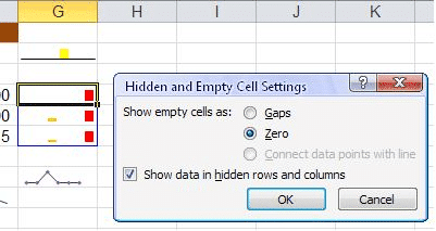
Empty or Zero values
If in a report, there are several blank cells and you wish to point this in the Sparkline then select the desired Sparkline and under Sparkline Tools | Design | Sparkline click “Hidden & Empty Cells”.

In the “Hidden and Empty Cell Settings” window you can choose to show empty cells as gaps or zero values. If the Sparkline is of Line type then you have option to connect the empty cell data points with a line. Suppose if there are some data in the report which are hidden but you wish the information to be part of the Sparkline then select the checkbox for “Show data in hidden rows and columns”.
Resizing and hiding
The usual examples show Sparklines as simple small, almost tiny, graphs next to the source data but they don’t have to be that way.
You can resize the sparklined cells to make them quite large , see the example above under the heading ‘The Sparklines Trap’. Resize the cell row/column to make them as large as you like.
Normally sparklines are placed next to the source data but they don’t have to be. You can display a Sparkline or group of sparklines based on data elsewhere on the worksheet, on another sheet in the same document or even another worksheet entirely.
Another option is to create the sparklines then hide the rows/columns with the source data. Make sure the ‘Show data in hidden rows and columns ‘ option is checked in the ‘Hidden and Empty cells settings’ dialog .