PowerPoint includes quick access to character spacing features that make slide titles stand out.
In PowerPoint there are two useful features to make a slide title jump out at the viewer. Character Spacing is quickly changed on the Home tab. More subtle is Kerning.
When it comes to Design, and clarity in Design, Space is almost as important as Content. This is also true when it comes to Fonts and Typefaces in PowerPoint.
Fonts are designed to look a certain “1 size fits all” way and for most applications that’s fine. However, depending on your audience and the medium your communicating in you may need to tweak the Readability of the Font to accommodate.
Character Spacing is in Word but without the simple pull-down list. Kerning is available in both Word and PowerPoint.
Quick Character Spacing in PowerPoint
PowerPoint has a quick Character Spacing tool under Home | Fonts .

Here you can see the options supplied by default with the Tool:
- Very Tight
- Tight
- Normal (as the Font Designer intended)
- Loose
- Very Loose
- More Spacing Options.
So, how do these play out in the wild? Time for a few examples… (Bear in mind that the effects of this are subtle and work to unconsciously improve the readability of a text).
Either highlight the text to be altered or Select the Text Box that contains the Text and you can make your changes.
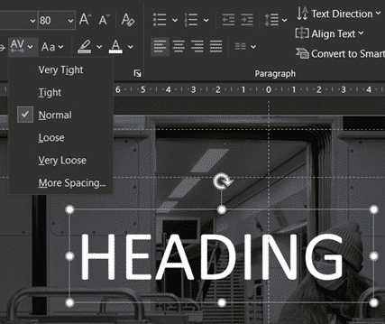
Normal Character Spacing
We’ll start with Normal spacing. This uses the spacing defined in the font itself.
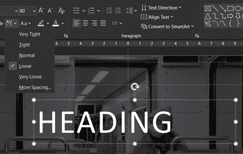
Loose Character Spacing
Most likely you’ll use the Loose or expanded spacing options in PowerPoint. They make a title stand out a bit more. It’s an effect commonly used in TV/movie titles.
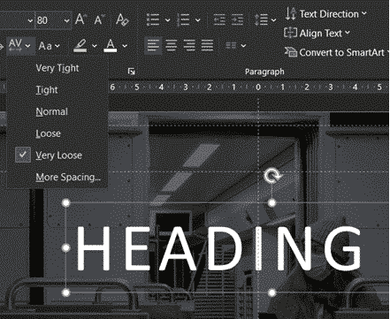
Very Loose Character Spacing
Tight Character Spacing
Tight or condensed spacing is less common but worth keeping in mind.
Reducing the letter spacing lets you fit a bit more text into a single line. When the heading is wrapping by just a letter or two, try tight character spacing instead of dropping the font size.

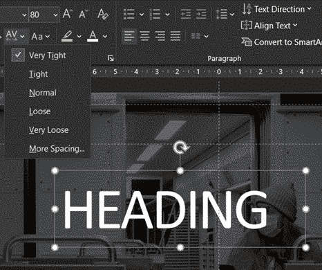
Very Tight Character Spacing
Which leaves us with the last option of…
More Spacing Options
Home | Fonts | Character Spacing | More character spacing
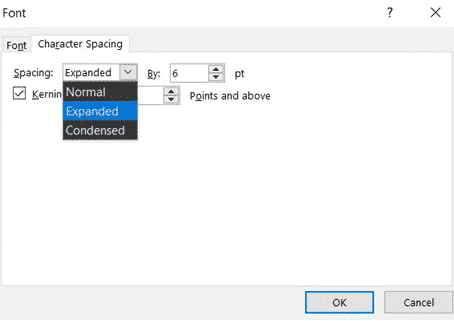
Normal – no change in character spacing
Expanded – increase the spacing between letters
Condensed – decrease the spacing.
It will go up or down in increments of 0.1 with each click of the arrows.
This is a very fine, surgical way to make adjustments; however, if you need to make a sizable adjustment then just click in the box and add in a numerical value, click OK and see what that looks like.
Very loose text (Expanded with a large pt value) can become unreadable because the letters are too separated. The human eye sees them as individual letters not a word.
Going too tight (Condensed with a large pt value) crunches the letters too closely and becomes an unreadable mess.
Kerning for fonts
Apply Kerning to Fonts that are X Points in size and Above. Kerning makes fine adjustments to letter spacing depending on how letters ‘fit’ next to each other see Kerning settings in Microsoft Office

Kerning fonts and why it matters in Word and Powerpoint
2001: A Space Odyssey and font kerningb