A fascinating article digs into the ‘new’ Windows 10 look to reveal that it’s not as new as Microsoft hype would have you believe. Some parts of Windows 10 are over 25 years old and it’s a similar story in Microsoft Office, despite the Ribbon.
It’s the same in Microsoft Office, scratch the Ribbon and you’ll find dialogs and options that haven’t changed for many, many years.
Windows ‘look and feel’ has developed over time with technology added on top of what’s already there. Instead of the ‘new look’ often boasted by Microsoft, it’s more like a different coat of paint and maybe a hood ornament stuck on the existing ‘car’ that’s Windows.
As ‘NTDEV’ shows, there are eight layers of tech to make up the Windows 10. Some parts of Win10 date back to Windows 95. The Run box might look different but it’s really the same as 25 years ago.

The different styling makes many people think it’s new and different but it’s not really. That’s partly a practical element of software development but mostly to fool customers they’ve bought something newer and more updated.
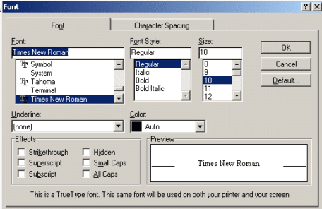
Here’s an example of how little core elements of Office have changed over decades.
On left is Format | Font from Word 97 (with Clippy included for old times sake).
At right is the very latest Word 365 equivalent available ‘under’ the ribbon – click the arrow icon at bottom right of Home | Font.

As you can see, there’s been little change over 23 years. The colors have been updated but most of the choices are still there and in the same place.
Despite two decades and the introduction of the Ribbon – the core interface of Office hasn’t altered as much as Microsoft likes to boast. Back when Office 2007 was released Office-Watch.com said:
“The ribbon is a shiny new exterior for Office but the inner workings are much the same. “
Compare the 97 and 365 versions of Font settings. All the options are in the same place. Underlines can now colored separately. We’ve lost a few Effects (Shadow, Outline, Emboss, Engrave) which can now be done more creatively via Text Effects (bottom button).
You have to go back to Word 95 to see any notable change in the Font dialog. Even then, it only takes a moment to find all the core elements, just moved around the screen a little.
The unchanging core of Office is a good thing. It means moving from one version of Office to another isn’t hard. Just look past the glossy exterior and ‘exciting’ hype and you’ll find the same options in the same place, year after year.