Businesses are reopening, which is great. Here’s some suggestions for big signs to let customers know you’re open, with some Word tips to make the letters as big as possible.
What’s needed is a BIG sign that catches the eye from a distance or when passing in a bus. Getting a special oversize sign is possible but can be expensive.
We have some suggestions for effective signs you can make in Microsoft Word with standard Letter/Legal/A4 paper. Walking around we’ve seen some small, faint and hand-written signs that are almost useless and offend our geeky sensibilities.
No special skills are necessary but there are some Word tricks and settings needed. Microsoft Word (Windows, Mac, iPad or online) with a printer and some plain white paper.
Here are two broad options, a single landscape page or a letter per page.

‘Letter per page’ is four pages with a single enormous letter on each page. Paste up all four pages next to each other, perhaps with some overlap or trimmed sides.
Not so simple
Both seem simple but a little Word trickery is necessary. The very large font sizes reveal some anomalies in formatting.
Change Line Spacing
Very large font sizes leave a lot of space above and below the letters themselves. That limits what you can fit on the page and the maximum font size.

Reduce that vertical spacing by changing to an Exact line spacing. Choose a spacing that’s a little below the font size. In this case, 330pt letters can appear on a 270pt line. Go to Paragraph settings | Spacing | Line Spacing or Home | Paragraph | Line Spacing | Line Spacing options …

Try out settings to see what fits. Too small line spacing will clip the top or bottom of the letters. See above example where there’s no more space above the letters.
As you can see, reducing the line spacing allows both lines to fit on a single page.
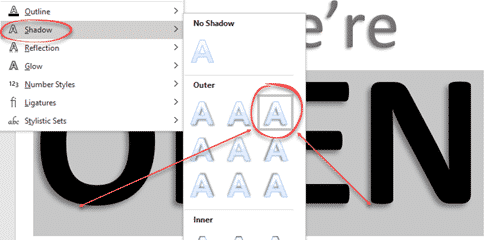
Shadow effect
To help the letters stand out better, we applied a subtle Shadow effect. Home | Text Effects | Shadow | Outer
Smaller margins
Give yourself as much page space as possible by reducing the margins on all four sides. Either drag the margins on the rulers or go to Layout | Margins | Custom Margins.

Smaller margins let you fit in just a bit larger letters.
Vertical Alignment
Normally pages have Top alignment, in other words pages are filled from the top down. It’s so obvious that we don’t often think about it.
In this case, we want all the text to appear in the middle of the page with unused space equally above and below.
Fix that at Page Setup | Layout | Vertical Alignment | Center.

Font selection
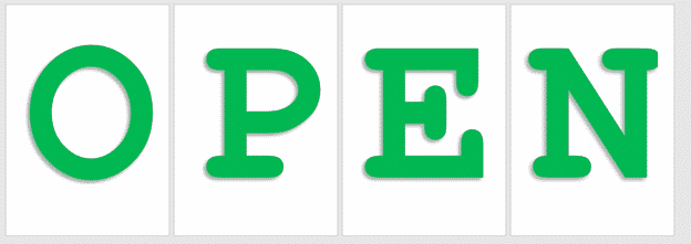
For the single page sign, any font can be used, preferably sans-serif. Stick to the professional fonts supplied with Windows/Mac/Office because those fonts are well designed and still look good in very large font sizes. We’ve used Calibri but Arial or Verdana are options. Please don’t use Comic Sans see Avoiding Comic Sans with these alternatives
With ‘letter per page’ option the font choice makes a difference. Our example above uses Courier New because the letters are centered nicely across the pages.
Compare that with Verdana where the letters aren’t centered on each of the four pages (especially P and E ).

Better to stick with a fixed space font like Courier New or Lucida Console.
Extra Tips
Change font by 1pt at a time
The shortcuts Ctrl + [ and Ctrl + ] are really handy when trying to fit letters onto a page, making them as large as possible without going over to another line.
Increase font by 1pt – Ctrl + ]
Decrease font by 1pt – Ctrl + [
This is a finer control than the buttons at Home | Font which jump by many points at time.
Bigger paper sizes
Local print shops (if open) can print to larger paper sizes (like A3 or even A2 in metric countries). Take your Word document (or a PDF version) to the printer and ask them to scale up and print to the bigger paper. Scaling up is a simple task for a professional printer.
Alternatively, change the page size in Word to match want the printer can do (even if that printer isn’t connected to your computer). Then format your document to the large page size.
Why better signs are necessary?
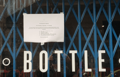
A couple of readers wondered why these examples are even necessary. Surely a business would have a big, big sign showing they’re reopened?
Here’s a few examples taken from a short walk around London. All used Word or similar word-processor but really, really badly.