In-cell charts in Excel provide a powerful method to visualize data trends and patterns. They allow you to quickly derive insights within a worksheet, making information interpretation more straightforward without fussing about with full charts.
We’ll explain how to make in-cell charts and then go further and show how to make them look better by adding details, using emoji and add color to show high/low values. Below are the examples of in-cell charts.
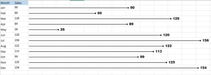
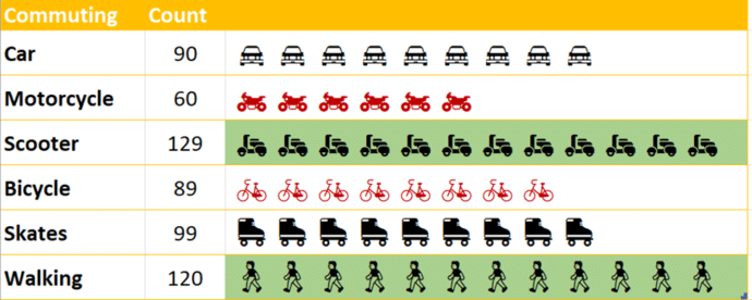
These charts can be inserted into a single cell or spread across multiple cells, providing a compact and efficient way to enhance data analysis . How did we create these charts without using the chart option and in such a short time?
One option is the REPT() function because it has more flexibility of symbol and scale. Rept() is such a simple function, it works in any version of Excel.
In-cell charts using REPT
Although often overlooked and underutilized, REPT is one of Excel’s hidden gems. Its primary purpose is to repeat a specific text string a designated number of times, making it a powerful tool for creating simple in-cell charts.
=REPT(“Text”, Number_of_times)Using the simple REPT function, you can build a dynamic inline chart. The sample spreadsheet displays the company and their Sales for the Year 2004.
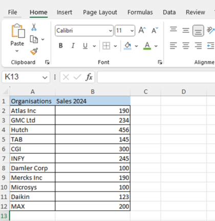
To create the chart, navigate to column C and insert the formula. Type = REPT("|",B2) and press Enter.
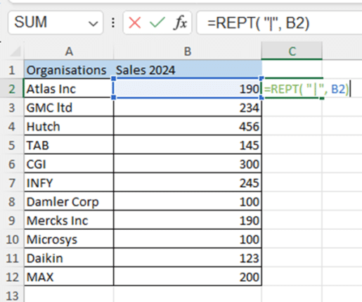
You will notice green pipeline as displayed in the below screenshot:
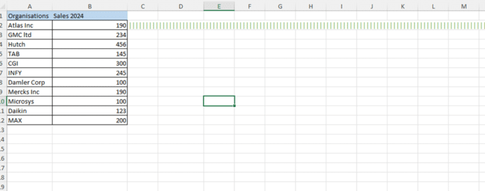
Select the Green Pipeline (|||) and navigate to Font and change the Font to Playbill, make it bold with Font size of your choice.
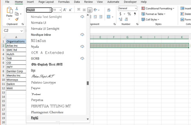
You will notice that the pipeline has been transformed into a bar graph with the pipeline symbols close together. You can hover over different fonts to explore which design best complements your sheet.
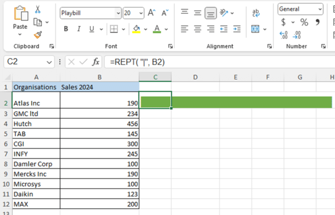
Now select the Bar chart and drag it down to populate the chart for the entire list.
Add the value at the end
At the end of the data bar, you can add the value usually with a separator.
=REPT("-", B2) & "● " &B2
Now the source value (column B) can be hidden to make a more compact but still clear chart.
Use Emoji
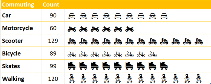
Instead of a symbol, use an emoji instead. Copy the emoji into the REPT() function. As you can see, the emoji can be different for each line.
Change the scale
Sometimes you need to adjust the scale of the data bar when the symbol is too big. For our Commuting table, 90 car emoji would go way off to the right of the screen, let alone 129 scooters!

The quick fix is to adjust the scale. Instead of repeating the source value, divide or multiply each by the same amount (10 in this example =REPT("🚘", B2/10) ). Now the proportions remain the same in the mini-chart.
Wrap text in cell
An alternative is to set the emoji or symbol to a small font size (4pt in this example) and change the cells to Wrap Text (Home | Alignment).
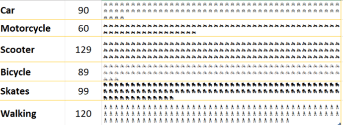
Colorize the mini-chart
With some symbols and emoji, you can use Conditional Formatting to add a little color.
Select the data bar cells then Conditional Formatting | New Rule | Use Formula to determine which cells to format. Then add a formula test that’s True for the value you want. Finally, choose a cell format, in this case a light green Fill Color.
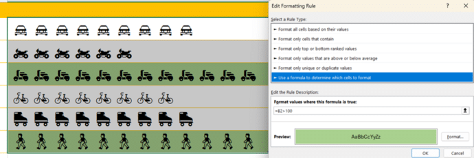
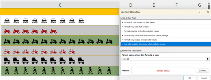
Add more than one condition, in this case lower values have the font color changed.
Make better Excel Charts by adding graphics or pictures