Some of the features and tricks in our COVID-19 worksheet for Excel 365.
We’ve made this workbook as a practical and timely example of some important recent Excel features and how they can be used.
Open up the workbook in Excel 365 for Windows and add some countries to see the whole table and chart update automatically.
Even better, dig into the formulas and settings to see how it all came together.
Geography data type
The Geography data type is a simple way to grab statistics and info about global locations. Some of the information is questionable because it’s scraped from web pages (mostly Wikipedia) however the country population should be sound.
Right-click on a Geography data type (look for the map icon) and choose Data Type | Show Card.
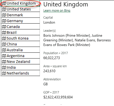
As you can see from this example, the data is unreliable. Boris Johnson is Prime Minister, but the others listed seem to be a random choice of ministers.
The Population value is added using the .Population parameter.

Population is a whole number, the visible value is changed using a custom cell format:
#,###.#0,,\ ""
The underlying number remains unchanged for calculations.

Link to COVID-19 statistics with Power Query
The data is imported from a web table using Data | Get and Transform.
Web scraping has been possible in Excel for some years but is a lot easier to manage with PowerQuery.
PowerQuery gives a lot of options for normalizing and tweaking the incoming data to make a table that works for your needs in Excel.
Little but important things like forcing the sort order and changing values so that Xlookup()/Vlookup() work properly in the workbook.
Sorting in Power Query
Sort order is important to an efficient and working Xlookup/Vlookup.
PowerQuery can force the order of the incoming data to whatever you need. Even if the web page changes order, the order in your worksheet will be the same.
Replacing Values to match names
Finding results with Xlookup/Vlookup needs names to match.
That can be a problem when the names vary, for example, US, USA, U.S.A, United States, United States of America.
We have to match the names used by Geography data type (United States or United Kingdom) with the name used by the web table (USA or UK).
PowerQuery has an elegant way to fix that; Replace Values. It will find values in a selected column and replace it. These steps are done each time the data is imported. ‘UK’ becomes ‘United Kingdom’ , ‘USA’ replaced with ‘United States’.

Match entire cell contents: check this box to only replace whole cells. This is important and defaults OFF and in many cases it needs to be ON.
In our download workbook there are other Replace Values for both Koreas (e.g. S. Korea to South Korea).
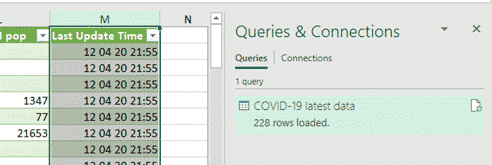
Last Refresh time
One of the problems with PowerQuery is the difficulty of getting essential data about the query itself. A common customer request is a way to get the last refresh time for the query.
Microsoft provides this important detail in the Stock data type but not easily for Excel PowerQuery.
Our solution isn’t the most elegant for the ‘Last Refresh time’ problem but it’s simple and works.
An extra column is added to the data table with the local time inserted. We used =DateTimeZone.Localnow() to add the date/time according to the current computer settings.

Now the Data table has an extra column filled with the time the query was refreshed.
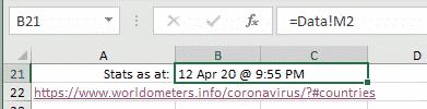
Of course, we only need a single cell not a whole column. On the main tab the ‘Stats as at:’ value is a simple reference to the top cell in the extra column.
Xlookup
Xlookup() makes the linking of data between tables a lot easier than the old Vlookup()

With Xlookup the references to the lookup value, list to lookup and value to return are clearly named. We haven’t needed the extra options for no result, lookup type etc but they are great to have.
Xlookup is a truly a great thing
Xlookup now available for all Excel 365 platforms
Conditional Formatting in reverse
The normal conditional formatting option for Color Scales has the higher value in green and lower in red. Next to each of those options is the reverse coloring (Red to Green).
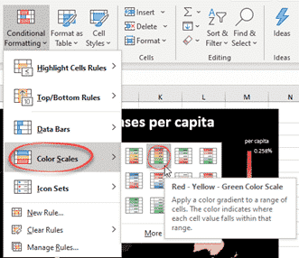
It’s not obvious from the labels but looking at the thumbnails, the Color Scales are in matched pairs.
Map Chart tricks
The Map Chart itself is simple to make. A lot easier than even a year or two ago. Select the two table columns to chart (hold down Ctrl to select columns not next to each other) then click Insert | Recommended Charts.
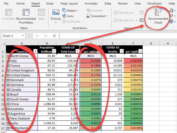
Excel 365 sees there are countries in the data and offers ‘Filled Map’ as one of the chart options.
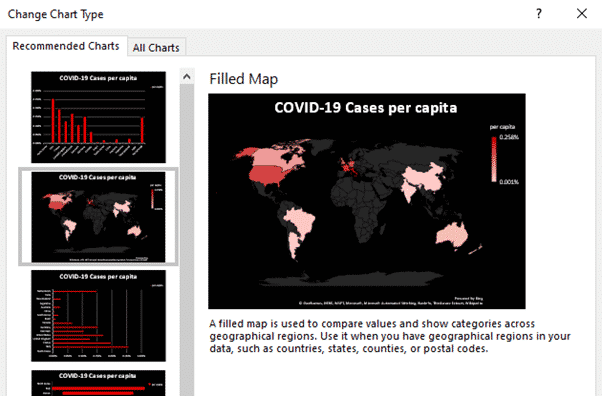
Microsoft’s color schemes are all quite bland and we felt COVID-19 needs something starker.
The black background for the chart makes the countries and colors stand out.
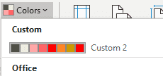
At Page Layout | Themes | Colors we added a custom color scheme with shades of red.
Extras to consider
There’s plenty of other tweaks you could try from the workbook. We make our sample documents and worksheets as a launching point for our reader to explore and expand.
We chose to pass all the web table columns through to the worksheet. In many cases, you’d remove unnecessary columns in Power Query to make a cleaner data table in the worksheet.
There are some unnecessary rows in the web table, multiple ‘Total’ rows and non-country values for special cases like cruise ships. PowerQuery could find those rows and delete them.
Change the % calculations to another form like Cases per million.
Add more charts and graphs.
Use Conditional Formatting on the ‘Stats as at’ time to warn if there’s been no update for a while (maybe a day?).
Add buttons to update/refresh data or resort the table.
COVID-19 worksheet for Excel 365
Prepare your computer for isolation or quarantine
Cool Excel Year Planner now available for download
Xlookup now available for all Excel 365 platforms