Keep track of COVID-19 statistics using this automatically updating Excel spreadsheet that shows the latest cases and deaths for selected countries with populations also added for you.
We’ve been a little annoyed at media coverage that deals with raw numbers without adjusting for population. We opened up Excel 365 and made use of its Geography data type plus Get & Transform and Map Charts.
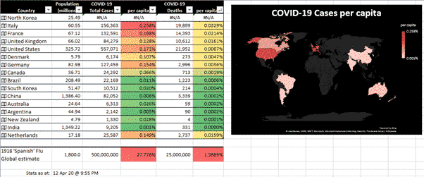
We’ve made this workbook as a practical and timely example of some important recent Excel features and how they can be used.
Geography data type pulls in statistics about locations around the world. Many of those stats should be treated with care but the Population per country should be OK.
Add more countries to the bottom of the table and the map will update automatically. All the columns are sortable from the pull-down buttons on each heading.
Compatibility
The main workbook download only works with Excel 365 for Windows.
That’s not our choice, it’s Microsoft.
Three key features are only available together in the Windows release of Excel 365; Geography data type, Get & Transform/Power Query and Xlookup()
If you’ve held Office 365 to an earlier version, maybe you’re not sure if your Excel 365 is compatible? The simplest thing to do is just download and open the workbook. Either it’ll work or there’ll be cells with errors. The workbook can’t hurt your Excel or computer.
Get & Transform / Power Query is a major omission from Excel for Mac.
See COVID-19 stats in Excel 365 for Mac
Download
Download the COVID-19 per country/per person workbook here.
Right-click on the link and choose ‘Save link as …’ or ‘Save Target As ..’ depending on your browser.
It’s a standard .xlsx Excel workbook that works in Excel 365 for Windows only.
The inevitable disclaimer: We’ve checked and rechecked the download for viruses and other nasties. However, you should never take anyone’s word for that and check for yourself. Windows Defender will automatically check for you. Leave the seat down. Take the cat out. Remember to call your mother.
How to use
Open in Excel 365 for Windows.
As usual the ‘External Content’ warning appears because of the Get & Transform link to a web page data source. Click Enable Content to proceed.

Wait a few moments while the link to the COVID-19 stats are updated. The population figures will also refresh, though they don’t change often.
Refresh data
We’ve set the COVID-19 data to refresh automatically when the workbook is opened and again each hour. See Data | Queries and Connections | Refresh All | Connection Properties.

Update the COVID-19 data at any time from Data | Refresh All or Ctrl + Alt + F5.
See when the COVID-19 data was last refreshed below the table. It appears in local time for that computer.

It’s the time that Excel last grabbed data from the web page, not the time of the most recent update of that web table.
Showing the query update date and time is one of those things you’d think that Microsoft made easy but is really obscure and indirect. See COVID-19 Excel workbook – under the hood
Add more countries
To include more countries, type a country in the first column of empty row below the main table.

Make sure the country name is an exact match for the name in the Data list. For example, it’s ‘Netherlands’ not The Netherlands or Holland.
Press Enter and Excel will fill in the other cells, extend the table and include the new results in the conditional coloring.

There’s a way to change the names used in the data list see COVID-19 Excel workbook – under the hood’.
Data source
COVID-19 stats come from a table at Worldometers which seems respected and is updated regularly.
It’s imported, converted and tweaked using ‘Get & Transform’ and the awesome but complex PowerQuery. See COVID-19 Excel workbook – under the hood
Don’t touch the table under the ‘Data’ tab. Any changes will be overwritten next time the query is updated.
If the country name can’t match with the Geography data type you’ll be asked to select a near-match or there’s a #FIELD error in Column B.

If the country name doesn’t match the Data list, there’s more #FIELD errors.
Comparison statistics
The 1918 ‘Spanish’ Flu is added below the main table for comparison. Both the cases and deaths are estimates. The Death estimates, in particular, vary between 17m and 100m.
You could add more comparison values like ‘Spanish’ Flu stats for individual countries.
Or add stats for other influenza outbreaks.
Reading the worksheet
Some things to keep in mind reading the COVID-19 worksheet.
We chose the % display because many of the published figures for past pandemics come in that form. There are other ways to ‘slice and dice’ the same calculations, e.g. ‘Cases per million’.
Read the statistics with care. This is an ongoing situation and the stats vary in reliability.
We’ve included North Korea as an extreme example of that. No-one believes that the DPRK is coronavirus free despite what the regime says. The official Chinese statistics seem improbably low.
Testing availability impacts the count of COVID-19 cases. Where there’s not enough testing kits available, the cases numbers won’t show the full extent of the disease. That’s probably one reason why the Indian statistics are so low. Most countries are suffering from a shortage of testing kits with the possible exceptions of South Korea and Germany.
The cause of death might not be accurately recorded as COVID-19 or the government could be hiding the real statistics.
Health reporting systems across the globe aren’t always fast nor accurate. Even major countries like the UK have had trouble marshalling daily updates from across the country.
The data table we’re linking to has its own ‘per million’ values that seem to be using different population figures than the Geography data type.
For a different look at the world situation with ‘per head’ statistics, check out The Washington Post.
See COVID-19 Excel workbook – under the hood
Prepare your computer for isolation or quarantine
Cool Excel Year Planner now available for download
Xlookup now available for all Excel 365 platforms
Troubleshooting
A few people have reported problems. Usually #NAME errors or the map chart doesn’t appear.
The solution is to ensure your system is updated to the latest release of Office 365. Some people think they have an updated Office 365, but they don’t.
The workbook needs a recent release of Excel 365 for Windows. That’s the only version which has all the features necessary.
The workbook was made with public release version 2003 build 12624.20320. And tested on a slightly older Excel 365 version 2001 build 12624.20320 (mid-February 2020). Look on the File | Account pane for the Version/Build numbers.
Corporate users might find that their organization hold back the latest Office 365 release from Microsoft and updates twice a year, not monthly.