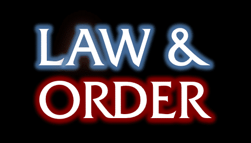
Here’s how to make a lookalike for the Law & Order TV show title card in either PowerPoint or Word.
Last week we showed how to make the Law & Order opening screen image and how to use that look in slides or documents.
Many readers asked why Office-Watch.com didn’t do the main title card. The reason is simple – Microsoft Office can’t get close to that look. We’ll explain what’s possible as an example of some Word formatting tricks.

It looks simple enough because Office has both Glow and Shadow text effects.
Here’s the closest we managed:
We’d love to hear from readers who can figure out some better options. Here’s what we did in PowerPoint or Word.
How we made the Law & Order title card
The font is Friz Quadrata, just like the L&O opening screen. Friz Quadrata is a commercial font but a free equivalent is Albertus Medium at Wfonts.com. We’ll use Friz Quadrata in these examples.
Add Glow
The ‘glow’ effect is available in modern Office. It’s available via the Text Effects button on the ribbon but we need more detailed choices so we’ll jump straight to the Text Effect pane. Select the text, right-click and choose ‘Format Text Effects’

Here’s the settings we used:

Preset: none, this is a custom job.
Color: We used a color picker to match the logo. RGB: 100, 162, 229. This is an approximation because the logo uses a mix of blues and Word can only ‘Glow’ in a single color. That said, we’re not entirely happy with that color choice.

Size: 16pt seems about right
Transparency: 35%
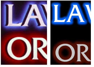
Shadow
The text shadow in the logo is different from how Word does shadow.

From the inside, there’s the white letter, then the shadow effect surrounded by the blue glow effect.
Word adds the shadow effect (Outer,Offset: Left) outside the letter and glow. That’s hard to see when the shadow is black so we’ve changed the shadow color to Yellow for this example. As you can see the yellow ‘shadow’ is outside the blue glow.

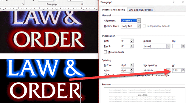
Line Spacing
The final tweak is the line spacing. The two logo lines are closer together than Office would normally allow.
Even if you use a line break (Shift + Enter) instead of a paragraph break, the two lines are far apart.
This often happens with larger text sizes in Word. Which brings us to a common Word question …
Make line spacing LESS than single
Word lets you set line spacing less than 1 but it’s not obvious. Go to Paragraph | Line Spacing | Multiple . The default is 3 but you can type in a value less than one. The lower the value, the closer the lines will be.
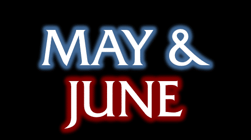
Different Words
You can use this look as the basis for your own slides or documents. See Law & Order titles and sound in PowerPoint and Office for examples of how a design can be adopted to your own needs in a Word document.
Law & Order titles and sound in PowerPoint and Office
Thunderbirds are go, get the look in Word and Office
‘Friends’ logo or text complete in Word, PowerPoint and Office
Murphy Brown in Word or PowerPoint