Microsoft Word has almost all you need to make ‘hand written’ notes and letters for a fraction of the cost of a special service. Dig into some of the lesser known Word font and line spacing settings to get that ‘written by hand’ effect.

The New York Times has a report on Bond – a new company that can print out ‘handwritten’ letters and notes on special machines.
The ultimate is a package which includes a font based on your own handwriting. It’s a great idea, especially for those of us with awful handwriting. There are services which will take your handwriting samples and supply a font.
Peter, our editor-in-chief, has famously unreadable scrawl. He started using computers in the 1980’s because the word-processor plus printer could produce legible documents! Alas even a personalised font would not be a help!
What you need
Except for one thing, you probably have everything to make your own ‘handwritten’ letters.
Script font
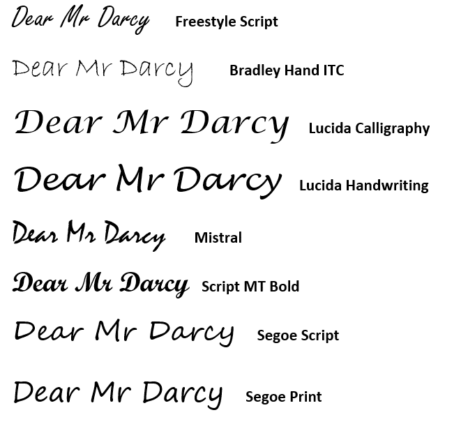
There are various Script fonts supplied with Windows and Office. Among them: Freestyle Script, Bradley Hand ITC, Lucida Calligraphy, Lucida Handwriting, Mistral, Script MT Bold, Segoe Script and Segoe Print.

Some of the more complex handwriting fonts can be almost unreadable when used for more than a few words. Generally speaking, script fonts with less serifs work better for paragraphs of ‘handwritten’ text.
Font Color
Black text will probably work best but you might try a slightly grey color option from one of the first three theme color columns in the Font Color selector. The lighter color evokes the very slight irregular color of ink.

Another possibility, of course, is blue text using one of the shades.
Line Spacing

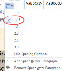
Left justification is best for the hand written look plus a slightly higher line spacing. We use 1.15 line spacing, varying the line spacing just a little can also help.
Character spacing, scale and position
Check out the first paragraph of the letter from Mr Darcy above. It has deliberate text irregularities to make it uneven. We left the bottom two paragraphs untouched for comparison.

Word’s enforcement of regular line and text spacing is usually a virtue, but not when you’re trying to copy the look of a hand written letter.
Try varying character spacings to emulate handwriting irregularities at Font | Advanced | Spacing. Also try Scale and Position settings in the same place. Select a few words then change the Advanced Font settings slightly.

Scale – between about 98% and 102%
Spacing – Expanded or Condensed by up to 1.2pt
Position – Raised or Lowered between 0.1pt and 1pt.
The trick here is small, subtle adjustments. Enough to evoke personal handwriting without drawing attention to individual changes.
Paper
Choosing the right paper is important. In a trip to the local stationery store you’ll find many paper options, most of which are inkjet/laser compatible.
Tip: buy a small paper pack and check that it works on your printer before spending money on a larger supply.
Paper Size
Which size paper will you use? For a short note, perhaps a half-size page is enough?
Metric paper size A5 or US ‘half letter’ can be made simply by cutting a larger page in half after printing.
Paper Color
Standard white paper isn’t ideal for the ‘hand written’ look. Go for something in off-white, light brown or other light colors.
Paper Weight
You’ll probably want to choose a thicker paper than the usual 20lb/80gsm stock. The look and feel of the paper is important to the overall effect.
The Text
Another part of the overall effect is the text itself. To ‘sell’ the handwritten effect, the sentences should be a little more casual than usual.
Paper or PDF
All these tips apply to paper or PDF output. You could make a PDF letter (File | Save As | PDF) then then attach it to an email.
But don’t try these formatting tricks in an email. Emails often look different to the receiver – a lot depends on the email program or browser they are using. In particular, the font you use might not be available to the reader – so your message can look very strange in a substituted font.
Cloud fonts are a handy extra in Microsoft 365
Make Cloud Fonts available to all programs, not just Office
Using WOFF fonts in Microsoft Office
Make Word line spacing LESS than single
Sentence spacing in Word – one, two or don’t bother?
Six Word tricks to reduce space between lines