In a recent blog post Microsoft explained some of their thinking behind the redesigned Office mobile apps like the new ‘all in one’ Office app.
The company has done a lot of research into the way people use their mobile devices, including the many people who only use a smartphone with no laptop or desktop machine.
Source: Microsoft
Microtask
They came up with the idea of the ‘microtask’, breaking down a job like a Word document into smaller chunks like a paragraph.
That’s said to be the thinking behind new features in Office apps like:
- Play my emails in Outlook apps.
- Read Aloud in Word and PowerPoint
- Scanning photos direct into Word, PowerPoint or OneDrive
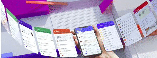
Fluent for iOS and Android
Fluent is Microsoft’s interface design plan now being extended into mobile devices.

Source: Microsoft
According to Microsoft there are seven elements involved.
- app icon
- splash screen
- cells
- cards
- typography
- people
- file lists
They seem especially proud of the bottom bar with “our brand-new, beautiful and friendly Fluent mobile icons ready to take action”.
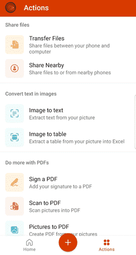
Putting aside all the buzzwords and flowery phrases, this is a typical Fluent screen design. Taken from the beta of the Office app.
Accessibility
Accessibility is a big thing at Microsoft these days and Fluent has to include compatibility with OS features like talkback screen reader in Android or dynamic type in iOS.
Fluent design kit
Microsoft hopes other apps with use Fluent in their apps and have released a Fluent design kit.
Of course, there’s the inevitable video which looks slick but tells Office users nothing practical or directly useful.
You can read the entire blog post at medium.com . not strangely Microsoft’s own blog post site.