A few annoying things in Excel 365 / 2019 / 2021 / LTSC Map charts that Microsoft should fix. We’ll explain the traps and some workarounds.
Making our COVID-19 Vaccination workbook reminded us of some anomalies in Excel Map Charts.
Always check the Map area options
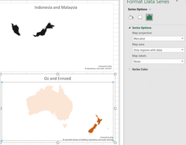
Whenever using the Map Chart feature, always go to Format Data Series | Series Options | Map Area and try the options available. The Automatic option isn’t always the best, in fact it can be pretty awful. Here are two examples of bad Automatic map area versions, one for Indonesia and Malaysia the other for Australia and New Zealand.

Both Automatic maps are bad, putting the countries in tiny areas of a larger map.
Trying out the Map projection and Map area options might help.
For Indonesia/Malaysia there was no good option. Either the countries were small on a large map or so obscure they were meaningless.
The Australia/NZ option fared better. Changing to ‘Only regions with data’ and a Mercator projection gives a decent looking map chart.
Note: Map Charts is a cloud service – your results may vary (probably will) if Microsoft changes the mapping service.
Polar regions included
All the World map options (Miller, Mercator, Albers or Robinson) include the polar regions, especially Antarctica. That takes up a lot of screen space that’s not relevant for most global maps.

A more useful Map Area option would be ‘World except Polar regions’.
Regions with data – include outlines
The Map Area ‘Only regions with data’ option is OK when most of the countries or areas have data but look silly in many cases. Aside from the missing countries and entire continent, there’s also the large ‘polar’ spaces at top and bottom.

Adding an outline of the missing areas would make ‘Only regions with data’ look a lot better.
There’s a similar problem with the default for just selected US States. This Excel default Map chart makes it hard to tell which three states (CA, IO and NY) are represented.

Switching to ‘Only regions with data’ makes things worse. Another example of why an outline of the country or states would improve this view.

In this case there’s an alternative, change the Chart Style to something that turns the non-data states a neutral color.

What about regions or continents?
We were really surprised and disappointed that no region or continent was recognized by Excel Map Charts. Even just trying to map North and South America isn’t accepted.

Even stranger is the error message which says that ‘geographical data’ like ‘region’ will ‘work best’. The generic error misleads the user into thinking the problem is separation of labels from data, when it’s really that the labels aren’t recognized.
How about it Microsoft?
You’d now have a lot more data on how people are using Excel 365 Map Charts. Spending some development time/money on improving the map choices would be appreciated by paying customers.
Quickly add continent maps to your Office documents
Maps of Europe for PowerPoint
Easy charts and summaries in Excel
Auto updating your Excel Charts
Excel 2016 new charts