The biggest complaint about Excel in recent years has been the lack of innovation in charts. There’s many interesting and useful charting options available in other software and web services. Poor old Excel’s charts are looking tired.
Excel 2016 changes that with six new chart formats. They are the first truly ‘exciting’ thing to see in Office 2016 (to borrow Microsoft’s overused term).
You can find five of them on the Insert Chart ribbon or the All Charts dialog: Treemap, Sunburst, Box & Whisker, Waterfall and Histogram.

The sixth, Pareto, is under the Histogram option.
Treemap
Perhaps the most interesting new chart is Treemap, because it’s quite different to the look of other Excel charts.
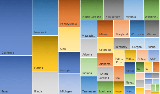
There are nine supplied Treemap variations, most of which include a legend.
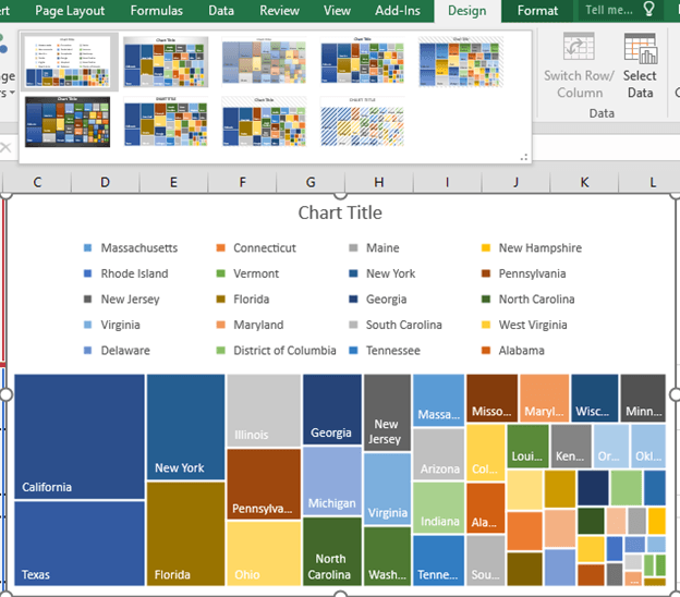
It’s possible to show sub-groups as well. The above chart could be separated into regions then states.

You may need to explicitly select Treemap from the list of charts. Microsoft explains that Treemap will not appear in the Recommended Chart list unless “empty (blank) cells exist within the hierarchal structure”.
Treemap is a welcome addition to Excel though it does show up some limitations in the current chart infrastructure. Notice how the state names don’t elegantly fit into the blocks? Ideally the font size would adjust to make more labels readable (though there’s a limit to that with the tiny blocks).
Chart tooltips are still woeful with no direct way to customize and tidy up the tooltip. People are used to hover their mouse on a web page to see more info, but that’s hard to do in Excel.

The above tooltip should, at least, be easily changed to read “Arkansas Pop. 2,959,373 (2013)” or add even more data “Arkansas Pop. 2,959,373 (+9.10%)”. Sadly that’s not possible unless you mess with VBA.
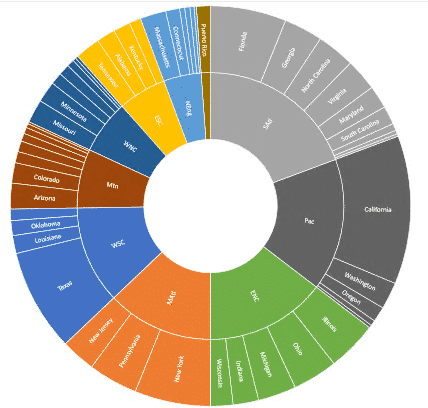
Sunburst
Related to Treemap is Sunburst and is another very welcome addition to Excel charts. Source: Microsoft
Sunburst is similar to Treemap; both are visual comparisons of relative sizes. The difference with Sunburst is showing the links between groups and sub-groups. In the above example, you can see that about half the Childrens books are for Ages 3-5 and that sales of those books is a largest sub-group of sales overall.
Here’s another example with the same data as in the Treemap chart above:
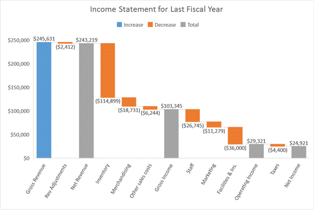
Waterfall
Waterfall is good for showing ‘above and below the line’ results. What is doing well and what isn’t
 Source: Microsoft
Histogram
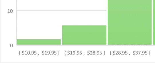
There are two new Histogram charts in Excel 2016; Histogram and Pareto.
At first glance, Histogram looks like nothing new, a standard column chart.

Source: Microsoft
The difference is that each column represents a range of values (called a bin) instead of a single value.
Pareto
Pareto is another form of histogram. According to Microsoft “you can automatically sort the frequency of the most prevalent issues (the bar graph) and then show the additive contributions of each issue as you move along the horizontal axis (the line graph).”

Box and Whisker
This is another chart which can show you details of a distribution. Not only can you see the range of data but also the mean (average), quartiles and outliers.

With this view you have less risk of getting a distorted impression of the values that a mere average or even range can do. The outlier marker is an especially nice touch.
