Some of the features, tips tricks in our new COVID-19 vaccination statistics workbook for Excel 365.
See Get COVID-19 vaccination stats and more from Excel for info on the workbook and what it does.

We’ve made this workbook as a practical example of some important recent Excel features and how they can be used.
Open up the workbook in Excel 365 for Windows and add some countries to see the whole table and chart update automatically.
Even better, dig into the formulas and settings to see how it all came together.
Link to COVID-19 statistics with Power Query
The data is imported from another Excel workbook using Data | Get and Transform.
PowerQuery gives a lot of options for normalizing and tweaking the incoming data to make a table that works for your needs in Excel.
Four queries
The workbook has four separate queries, all from the same data source. Two are necessary for the display worksheets, the others are there for your convenience if you want to extend the workbook.

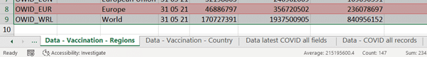
Vaccination Stats – Countries
Vaccination Stats – Regions
The two main queries with only the most recent data for each country or region. Many unnecessary fields/columns have been removed.
Only latest COVID data from OurWorldinData
All the most recent data for each ISO country code. A combination of the two ‘Vaccination Stats’ queries into a single table.
All COVID data from OurWorldinData
Everything from the OurWorldinData data source. All dates and all fields.
All four queries are loaded into worksheets prefixed with ‘Data …’
Speed up tip
If you’d like to speed up the refresh, remove the query ‘All COVID data from OurWorldinData’ which takes the longest to load. It has many more records than the other queries. That data isn’t lost because it’s all received for the other queries before being filtered out. If you need it later, just duplicate one of the other queries then edit the steps.
Filter out unnecessary rows/records
In this case there’s a lot of information we don’t need. PowerQuery can narrow down the table to just what we need.
Many of the records don’t have vaccination data. Add a Filter to keep only rows with a total_vaccinations value.

Remove Columns
There’s a lot of information in the data source, or more accurately ‘potential information’ since many of the extra fields/columns aren’t complete.
To make the visible Excel tables manageable, we’ve removed the unnecessary columns.
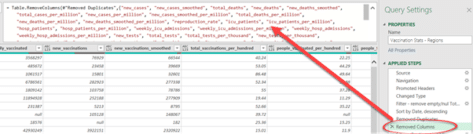
If you want to see some of that data in your tables, just delete those fields from the Table.RemoveColumns formula so they appear in the Excel table.
Filter by Regions
The Region/World statistics are in the complete dataset with special ISO Codes prefixed with OWID_ . We were going to filter by that prefix until we noticed the Continent field/column is null for the Region values (it’s used for countries).

Easier to filter for rows were ‘continent’ is null.
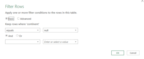
For the Vaccination Stats by Country the filter is reversed ‘Continent’ does not equal ‘Null’.
Get latest data for each country
The data source has historical data for each country in the Date field. That makes it possible to track a countries progress over time but we only need the latest data.
PowerQuery filtering to get the most recent row/record for each country/group isn’t as simple as you’d expect. In fact, the method you’d expect to use gives incorrect results.
We’ve devoted a separate article to this seemingly simple PowerQuery need see PowerQuery mystery – how to Remove Duplicates, keeping most recent record
Last Refresh time
One of the problems with PowerQuery is the difficulty of getting essential data about the query itself. A common customer request is a way to get the last refresh time for the query.
Our solution isn’t the most elegant for the ‘Last Refresh time’ problem but it’s simple and works.
An extra column is added to the data table with the local time inserted. We used =DateTimeZone.Localnow() to add the date/time according to the current computer settings.

Now the Data table has an extra column filled with the time the query was refreshed.

Of course, we only need a single cell not a whole column. On the main tab the ‘Stats as at:’ value is a simple reference to the top cell in the extra column.

Xlookup
Xlookup() makes the linking of data between tables a lot easier than the old Vlookup()

With Xlookup the references to the lookup value, list to lookup and value to return are clearly named. We haven’t needed the extra options for no result, lookup type etc but they are great to have.
Conditional Formatting in reverse
The normal conditional formatting option for Color Scales has the higher value in green and lower in red. Next to each of those options is the reverse coloring (Red to Green).

It’s not obvious from the labels but looking at the thumbnails, the Color Scales are in matched pairs.
Replacing Values to match names
Finding results with Xlookup/Vlookup needs names to match.
That can be a problem when the names vary, for example, US, USA, U.S.A, United States, United States of America.
PowerQuery has an elegant way to fix that; Replace Values. We’ve not had to use Replace Values in the new workbook but we’ll mention it here in case it’s needed for countries you add.
It will find values in a selected column and replace it. These steps are done each time the data is imported. ‘UK’ becomes ‘United Kingdom’ , ‘USA’ replaced with ‘United States’.
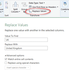
Match entire cell contents: check this box to only replace whole cells. This is important and defaults OFF and in many cases it needs to be ON.
If you’re having trouble adding more countries, we’ve added a hidden column (Col I) which shows the country (location) that Xlookup() has found in the data list.

Map Chart tricks
The Map Chart itself is simple to make. A lot easier than even a year or two ago. Select the two table columns to chart (hold down Ctrl to select columns not next to each other) then click Insert | Recommended Charts.

Excel 365 sees there are countries in the data and should offer a ‘Filled Map’ as one of the chart options. If not, select a Map Chart.
Change the look from the Chart Options tab.

There’s no map for the Vaccinations by Region table because, amazingly, Excel maps don’t support regions/continents!
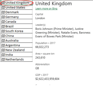
Geography data type
The Geography data type is a simple way to grab statistics and info about global locations. Some of the information is questionable because it’s scraped from web pages (mostly Wikipedia) however the country population should be sound.
In past versions the COVID workbook we used the Population data from the Geography data type. It’s not necessary now because the new data source includes Population data.
We’ve kept the Geography data link so you can access other information or just add a little decoration with the .Image field (aka Flag) for each country.
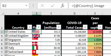
Right-click on a Geography data type (look for the map icon) and choose Data Type | Show Card.
Formatting millions values
Population is a whole number, the visible value is changed using a custom cell format:
#,###.#0,,\ “”
The underlying number remains unchanged for calculations.

Extras to consider
Like all Office Watch downloads and samples, they are intended as a starter for you to tinker and learn.
There’s plenty of other tweaks you could try from the workbook. We make our sample documents and worksheets as a launching point for our reader to explore and expand.
Change the % calculations to another form like Cases per million.
Add more charts and graphs.
Use Conditional Formatting on the ‘Stats as at’ time to warn if there’s been no update for a while (maybe a day?).
Add buttons to update/refresh data or resort the table.
Feedback
We’d love to hear from our readers – any comments or suggestions for improvements via the Feedback page.
Keep in mind we’re not responsible for the statistics which come from OurWorldinData.
Get COVID-19 vaccination stats and more from Excel