Officially a Gauge, dial or speedometer chart isn’t available in Excel. It’s a glaring omission from the in-built Excel charts but happily, it’s still possible with a little Excel trickery explained in this article.
A “speedo” (Aussie slang), dial or gauge chart is made with a combination of Excel’s Doughnut chart and a Pie Chart (a tiny, segment). Here’s the final product with the source data.

The multi-colored gauge is made with a doughnut chart from the data in Column A and B. The pointer is really a small slice from a pie chart (the rest is invisible or ‘no fill).
Create the Gauge Chart
You’ll need to firstly select Column B and Column D (hold down the Ctrl key to select both columns and just click on each letter at the top to select the entire column), then go to Insert | Charts | Insert Combo Chart | Create Custom Chart.

Select the Custom Combination (fourth one from the top)
Under Column1 choose Doughnut from the drop-down menu.
Under Column2 choose Pie from the drop-down menu. Under Secondary Axis, tick the Pie Chart Type.
Click OK.

Your chart will appear on the Excel Spreadsheet.
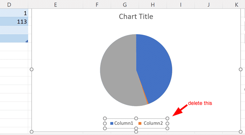
Select the legend and delete. You can also rename the Chart Title to something; in our example we have chosen ‘Chances of a sunny day’.
Ensure the Chart has been selected.
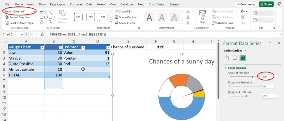
Go to Format | Current Selection and select Series “Column2” from the drop-down menu.

Select Format Selection

This will bring up Format Data Series on the right pane. Under Angle of first slice change it to 270 degrees.

Now, hold down the Ctrl key, and use the left and right arrow keys to select a single data point. Go to Shape Styles | Shape Fill and select the following for each point.
Point 1
Set this to No Fill.
Point 2
Set this to Black.
Point 3
Set this to No Fill.
Point 4
Set this to No Fill.

Now repeat the previous steps with Series “Column1”, where under Format Selection | Angle of First Slice is set to 270 degrees.
Now we will fill in the different colors for the gauge chart using the Ctrl key and left and right arrow keys.
Point 1 (Low)
Set this to Red.
Point 2 (Maybe)
Set this to Yellow
Point 3 (Quite Possible)
Set this to Light Green
Point 4 (Almost Certain)
Set this to Dark Green
Point 5
Set this to No Fill.
And there you have it!

Make better Excel Charts by adding graphics or pictures
Excel Charts are better looking with pictures
Auto updating your Excel Charts
Saving an Excel Chart as a Template