A ‘side by side’ comparison of the current Office default font for headings (Calibri Light) and the new default Aptos Display.
Aptos Display has thicker strokes/lines than Calibri Light and is, perhaps, more prominent as a heading font. See the slider below to compare the two heading fonts.
See New and old Office font – side-by-side comparison to compare the body fonts Aptos and Calibri.
Headings: Aptos Display vs Calibri Light
The current default heading font is Calibri Light, that will change to Aptos Display in the new templates.
[bafg id=”61603″]
Aptos Display and Calibri Light – both regular weight, 24pt.
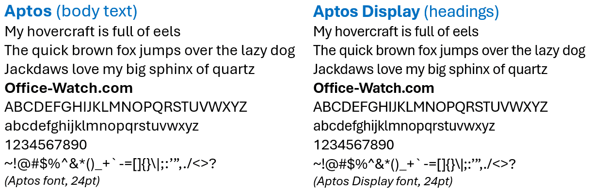
Aptos and Aptos Display
Here are the two new default fonts: Aptos for body text, Aptos Display for Headings.
Check out the winner and other new fonts in Microsoft 365/Office 2021
Two ways to change document defaults in Microsoft Word
Two ways to change the default font and more in Word