Gantt chart for project management or event scheduling are possible in Excel. Here’s the step-by-step help plus a complete sample worksheet for our subscribers.
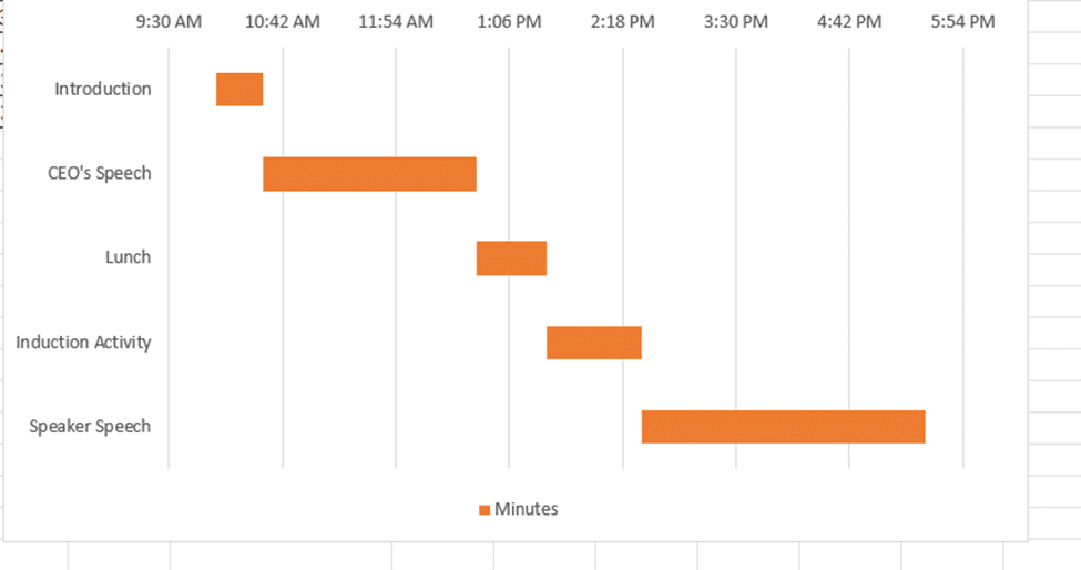
Gantt chart can be widely used in project management for visualizing project schedules. They break down a project or event into tasks or activities as horizontal bars on a timeline. Each bar signifies a task, its length denoting its duration, and its placement indicating its start and end times within the project’s timeline. You can easily see the progress and also when tasks overlap or depend on earlier tasks.
Gantt Charts are possible in Excel though you won’t find them among the supplied charts. We’ll explain how to make a Gantt Chart in Excel then a shortcut for Office Watch subscribers.
We’ll show how to convert a table (above) into a Gantt chart (below) that better shows how the events fit together and how long each lasts.

Start with a Table
In the sample spreadsheet we have the “Start Time” and “Duration of the Activity”. The “End Time” is only for our reference and can be calculated from the Start Time and Duration.

Make a Stacked Bar chart
Select the Event, Start Time and Minutes and insert a bar chart. Navigate to the “Insert” tab and choose the “Stacked Bar” chart under the 2-D Bar.

As soon as the chart is inserted, Excel will automatically generate horizontal bars representing each task on the timeline.
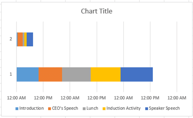
Change the appearance of the chart by right-clicking on the chart and click the “Select data” option.
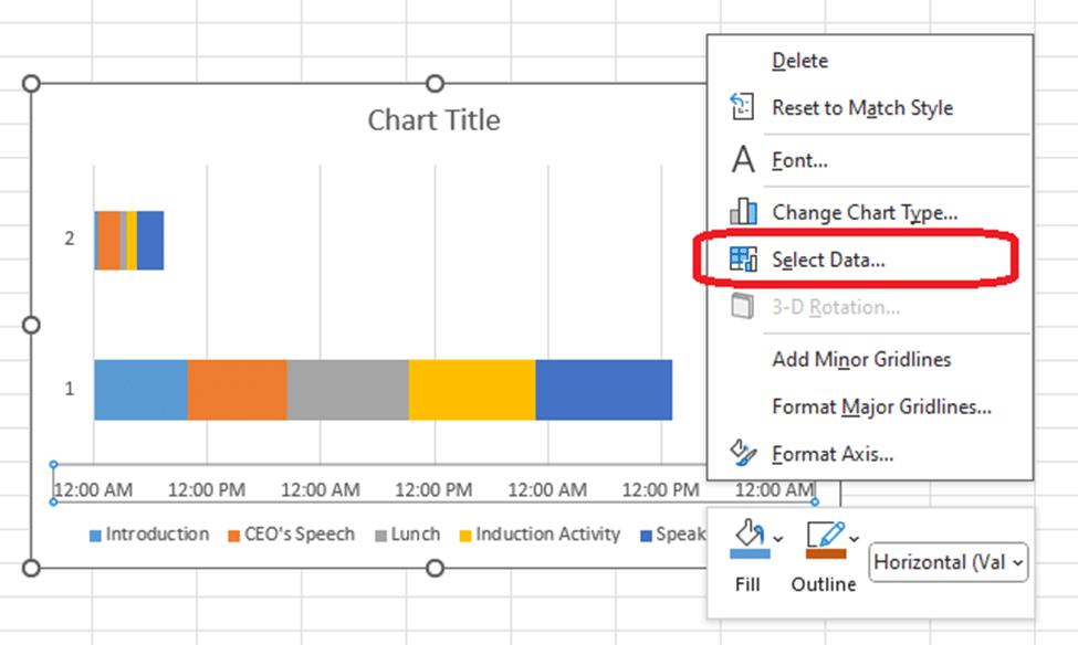
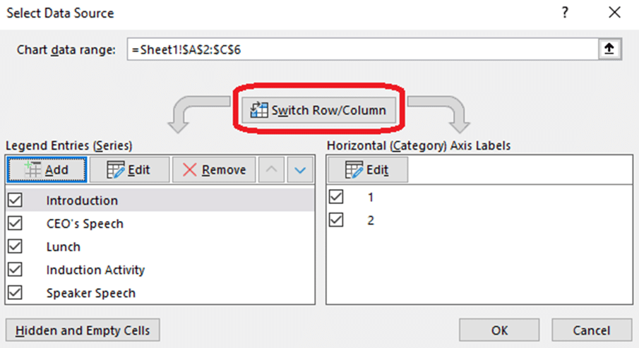
The Select Data pop-up will appear. Click the Switch Row/Column options to interchange the way your data is organized. This can sometimes be necessary to ensure your Gantt chart displays the information correctly.
After clicking this button, you may need to adjust other settings or formatting options to fine-tune your Gantt chart according to your project requirements.
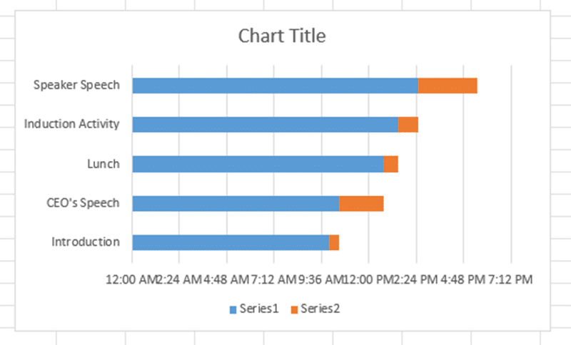
This is how the interim chart should appear:
Add Duration series
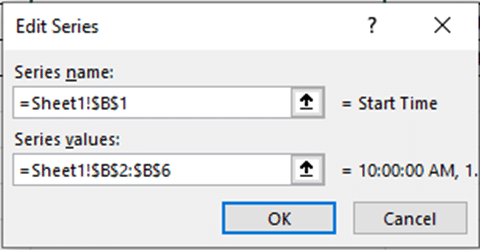
Now you can set up the Duration series, right-click on the Gantt chart, choose Select Data from the menu options, then click “Add” and select the Duration series. This will open the “Select Data Source” dialog box.
In the “Select Data Source” dialog box, click on the “Add” button. This will open the “Edit Series” dialog box.

In the “Edit Series” dialog box, enter the name for your Duration series in the “Series name” field. In the “Series values” field, select the range of cells in your spreadsheet that contain the duration data for your tasks.
Click “OK” to close the “Edit Series” dialog box.
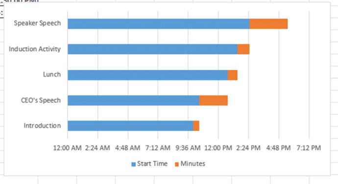
Similarly, In the Edit option, select the Vertical axis values. The vertical axis is the minutes of the event

After all that the chart should look like the one below.
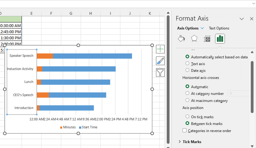
Categories in Reverse Order
Right-click on the chart, go to Axis Options, and select the “Categories in reverse order” option.
Time format / duration
You have the flexibility to select your preferred Time format under the number formatting.

Now Format the Axis options with the following inputs to get the desired Time duration:

The chart now resembles the one below:
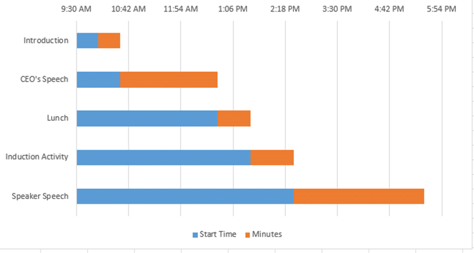
Almost there — the Gantt chart is in place (the orange bars) but with the additional (blue) bars to be hidden.
Hide unwanted bars with ‘No Fill’
Select the blue bars in your Gantt chart and format them by setting the “Fill” option to “No fill” to remove any color. Next, remove the gridlines to declutter the chart. Delete the legends to streamline the visualization. Finally, you can add a chart title for clarity and completion if you feel the need.
Now, your Gantt chart is fully prepared and ready to use.
Sample workbook
Office Watch subscribers can leap ahead by downloading the complete example worksheet.
It’s a standard Excel .XLS file ( no macros) with a complete working table plus chart. Change the cells highlighted in yellow.
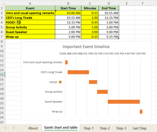
To quickly make a Gantt chart, just change the labels, start time and durations (the yellow cells) and the chart will change.
Add/delete rows to the table and the chart will adjust accordingly.
This download is available EXCLUSIVELY to Office Watch subscribers. The link to this and other special downloads is in each issue of Office Watch or Office for Mere Mortals
Make better Excel Charts by adding graphics or pictures
Auto updating your Excel Charts