Microsoft 365 Premium: Copilot AI, new Features & Pricing Explained
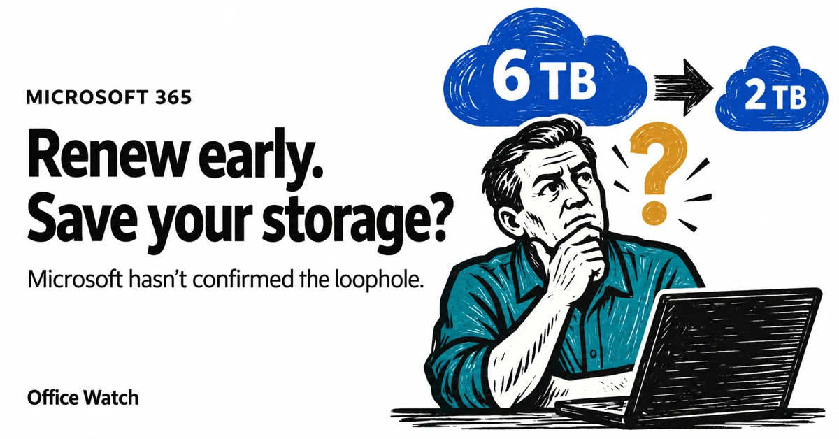
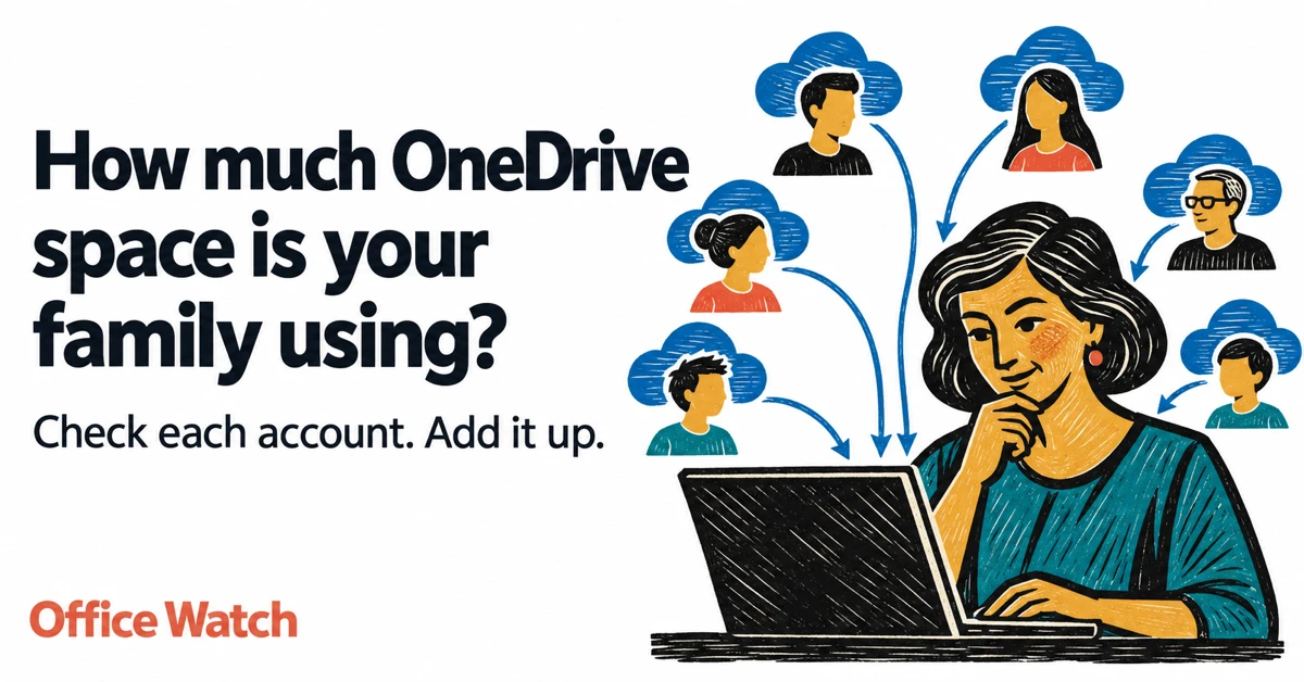
Microsoft 365 Premium is the newest consumer plan that bundles the popular Family subscription with Copilot Pro at a much lower cost. For $199 a year, subscribers get six accounts with full Microsoft Office apps, 1TB OneDrive storage each, and premium Copilot AI tools for the plan owner—including research, data analysis, and workflow automation. Our […]