Michelangelus: Microsoft’s Free Michelangelo-Inspired Typeface — Download It Now
Microsoft has released Michelangelus, a free serif font inspired by Michelangelo’s handwriting and carved lettering. You can download it today from the Microsoft Download Center, and it will appear as a built-in font in Word, PowerPoint and Excel by late 2026. Here’s what you need to know before using it, including a font substitution trap that could silently change your documents.
What makes up Michelangelus font
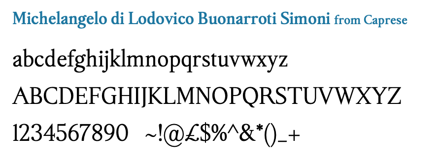
Four styles: Regular, Italic, Bold and Bold Italic.
More than 2,000 glyphs (individual characters, accented letters, numbers and symbols), according to Microsoft.
Latin script only. It covers Western European, Central and Eastern European, Turkish and Baltic languages. There’s no Greek, Cyrillic, Arabic, Asian or Vietnamese support, so check before using it for multilingual work.
Designer: Studiogusto, an independent Italian and German design agency. The copyright notice is dated 2024, so this has been in the works for a while.
Michelangelus Font: A Sampler of All Four Stunning Variants
Why Michelangelo, and why now?
The font was commissioned by the Fabbrica di San Pietro, the Vatican body that looks after St. Peter’s Basilica, to mark 400 years since the basilica was consecrated (the anniversary falls on November 18, 2026). Michelangelo designed the basilica’s dome, and the Fabbrica holds many of his manuscripts. Microsoft handled legal clearances plus the typographic and technical checks needed to ship it in Office.
Studiogusto made a deliberate choice not to create a handwriting or calligraphy font. Instead, they studied Michelangelo’s letters in the Vatican Apostolic Archive to understand his rhythm and proportions, then built a modern typeface from that. One detail that shaped their thinking: an elderly Michelangelo once burned an illegible letter from his nephew and told him not to write again until his penmanship improved. The designers took that as proof he cared about readability, not just beauty.
They designed the italic first, because italic was the normal way of writing in Michelangelo’s time. The regular style came afterwards.
Lowercase g first
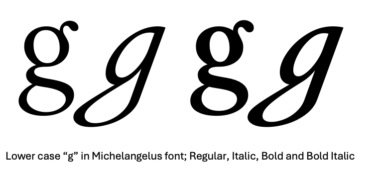
The lowercase “g” comes from Michelangelo’s signature. The team spent a full week on that one letter. The italic and bold italic versions look very different from the regular and bold letters.
The capitals are based on carved inscriptions, including the lettering on the sash of the Pietà and inscriptions in St. Peter’s and the Sistine Chapel, because Michelangelo’s handwriting didn’t provide a complete alphabet or set of numbers.
Slightly narrow
Michelangelus runs slightly narrow. Studiogusto’s founder Stefano Calandro says it isn’t technically condensed, but “you can feel there’s something condensed.”
Comparing Michelangelus font
Leaving aside all of Microsoft’s long explanations, Michelangelus is another serif font. It’s similar to Times New Roman or Garamond.
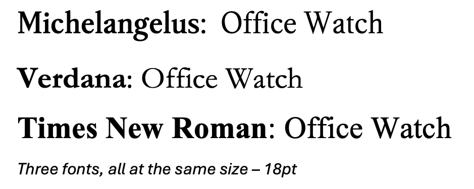
A slightly narrow serif fits more words on a line than something like Garamond (another serif font), which helps in headings, slide titles and tight layouts. Michelangelus takes up less horizontal space than Times New Roman but more than Verdana.
With its distinctive italic and sculpted capitals, Michelangelus looks like a natural fit for invitations, certificates, event programs, menus, title slides and report covers.
The video is better than the font
Aside from its interesting backstory, Michelangelus font isn’t that exciting. It’s another serif font, good for regular text. In most cases you could substitute any number of similar serif fonts and most people would not notice.
As one X user noted “The video is 100x better than the actual font“
Beware font substitution for Michelangelus
Since Michelangelus is similar to two other Office core fonts (Verdana and Times New Roman), you might expect them to be used as replacements. Font substitution happens when someone opens a file with a font not available on that computer. See All about Font Embedding in Microsoft Word — make sure your document looks the same across devices
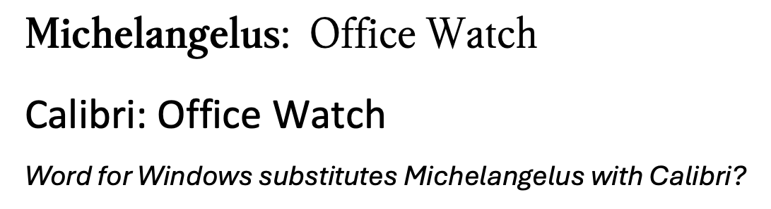
But don’t forget the screwy nature of Office/Microsoft 365 font substitution. A Word doc with Michelangelus text is converted to Calibri – a very different sans-serif font!
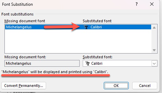
Here’s the two fonts that Word thinks are similar:
Beware sharing docs with Michelangelus font
The big warning: a manually installed font lives only on your computer. If you send a Word document or PowerPoint deck set in Michelangelus to someone who doesn’t have it, their copy will quietly swap another, very different font.
If sending a doc, sheet or slides with Michelangelus font:
- Embed the font in Word or PowerPoint: go to File | Options | Save and tick Embed fonts in the file.
- Send a PDF for anything final.
Get Michelangelus font now
Eventually Michelangelus font will appear as another Microsoft 365 cloud font in Office app font menus. But that might not happen for a few months, Microsoft hasn’t given a firm date beyond “end of the year.”
Get the font now from the Microsoft Download Center, unzip it, then right click each font file and choose Install (or Install for all users if you have admin rights).
All four styles are included as True Type fonts compatible with both Windows and Mac.
Once installed Michelangelus should appear in any app with a font list. Close and reopen apps after the font is installed to make it appear in the font list.
Fonts, Substitution and More
Want to see all four Michelangelus styles side by side? Our Michelangelus Font: A Sampler of All Four Stunning Variants lays out Regular, Bold, Italic and Bold Italic so you can decide which works best for your documents.
Microsoft’s default font family is also available outside Office. Microsoft’s Aptos Fonts for Free — Use the New Office Font Anywhere shows you how to download and install it, and Check out Kermit the font covers another recent Microsoft 365 typeface designed with accessibility in mind.
Font substitution isn’t just a Michelangelus problem. All about Font Embedding in Microsoft Word — make sure your document looks the same across devices explains how to embed fonts so your formatting survives, and Why Windows Replaces Helvetica with Arial — The Hidden Font Substitution Explained reveals another silent swap that’s been happening for decades.
The font wars extend beyond Microsoft, too. The U.S. government has flip-flopped between serif and sans-serif — first switching to Calibri and then reversing course back to Times New Roman. If you’re choosing between serif and sans-serif for your own work, those stories put the debate in perspective.
If you’re sharing documents broadly, font choice is only half the battle. Word Save As PDF Bug Silently Saves Files to Wrong Folder, How to Fix It is worth reading before you export anything, and PowerPoint – switch away from Aptos fonts walks through changing PowerPoint’s defaults if Aptos isn’t your style.