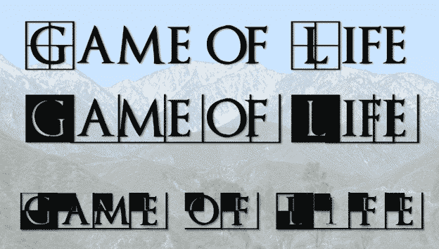
Here’s how to get the Game of Thrones or House of the Dragon look in Word documents and PowerPoint slides.
Plenty of people have borrowed the Game of Thrones or GoT look, including a certain US President. All these uses are contrary to various trademarks by HBO. Despite legal complaints there are many ‘tip of the hat’ to GoT.
Use some existing PowerPoint and Word features to make something that evokes the Game of Thrones theme.

See Also: Office ‘Gets’ Game of Thrones

Office-Watch.com has done this before. Using common movies or TV show designs as inspirations for unique looks. Formatting Magic with Word shows how to recreate the look of Star Wars and Thunderbirds plus blackboards or whiteboards.
GoT Fonts
What really ‘sells’ the Game of Thrones look is the font. The font used in the main TV show titles is available for sale online or there are alternatives.
Trajan Pro
The font used in the TV Show is Trajan Pro by Carol Twombly & Robert Slimbach. and distributed by Adobe.

Cinzel
Cinzel is a Google Font similar to Trajan Pro see Use Google Fonts free in Microsoft Office

Natanael Gama has made two versions. Cinzel is nearest to GoT’s Trajan Pro but you might prefer the more ornate Cinzel Decorative.
Game of Thrones
The Game of Thrones logo includes the double vertical bars in the letter O . For that we turn to the Game of Thrones font by Charlie Samways.

Game of Thrones logo
For the TV show’s logo, go online and do an image search.
Or use the Game of Thrones font mentioned above. Type # for the logo complete with long T

Trajanus Bricks
This is another Trajan Pro like font with capitals letters in boxes.
There are three Trajanus Bricks fonts: Regular, Inverse and Xtra.

Try combining the capital letter effects of Inverse and Xtra with the lower case of regular Trajanus Bricks.
Background Gradient Fill
Gradient background options quickly give you a faded background look. Format Background | Gradient Fill.

Images
Add whatever images you like. The Office 365 picture transparency option lets you slightly fade an image so it blends with the text. We did that in the first example above.