An easy way to make fancy text, especially headings, with extra style and flourish is with the OpenType Ligatures in Word for Microsoft 365, 2021 and earlier versions of Word including Word for Mac.
Microsoft Word supports OpenType Ligatures. Apart from Word, OpenType Ligatures are also applicable in Publisher and, to a limited extent, Outlook since Word is used as the editor in Outlook. Ligatures have been in Word since Office 2010 for Windows but somewhat buried in the menus so most people don’t know they are there or what they can do.
Behind the technical and typographical terms, Ligatures are a way to make your Word documents ‘pop’ with some fancy headings and flourishes.
Here’s an example of what you can do. The first line is plain text in Gabriola font. The second line is the same text and font but with ligatures enabled (style set 7) in Word.

Not all ligatures and styles need to be so extreme and they are best used sparingly and subtly.
About Ligatures
A Ligature is a special character that combines two or three letters into a single character or glyph. Ligatures avoid the unattractive collision that occurs in some typefaces. Most common ligatures are ff, fl, fi, ffi and ffl.
Combining the “f” and “i” or “f” and “l” into a single letter makes the “f” look more stable rather than giving an impression of falling on “i” or “l”.
OpenType fonts
OpenType is a relatively new format for scalable computer fonts that’s replacing the stalwart of Window fonts, TrueType. OpenType was developed by Microsoft and Adobe. Not all fonts are OpenType and not all OpenType fonts include Ligatures.
Gabriola font supports advanced OpenType features with extensive use of stylistic sets. For this reason we’ll be using Gabriola in all these examples.
Enabling Ligatures
To enable OpenType ligatures type some text in OpenType font like “Calibri” in a document.
From Home | Font choose the ‘WordArt’ pull-down menu to Ligatures:
In Word for Windows you can also Home | Font ribbon menu click on the small down arrow icon.

The Font properties window will pop open. Here click on the “Advanced” tab.

Under “OpenType Features” you can set Ligatures, Number spacing, Number forms and Stylistic sets to the selected text. Each feature has few options to choose from. Whatever options you choose, a preview of the result can be viewed in the “Preview” pane, though sometimes the preview pane is too small to see everything. It’s best to select some text before entering the font dialog to control what preview text is used.
After making appropriate changes click on OK button for the changes to take effect. You can even set the changes you make as default by clicking on “Set As Default” button.
OpenType Features
Let’s explore the various options under each OpenType feature.
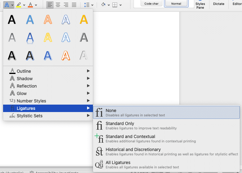
Ligature Options

None:
None of the ligature options will be applied unless the font supports any ligature by default. Not all OpenType fonts have ligatures.
Standard Only:

The standard set of ligatures contains the most commonly used ligatures like “f” and “t” but it varies based on language.
Standard and Contextual: Contextual ligatures as the name suggests are based on specific fonts and can be used with only those fonts. The combination of standard and contextual ligatures gives you the set of ligatures which can be used commonly.
Historical and Discretionary: Historical ligatures are usually used for that “period” effect and Discretionary ligatures are used for specific purposes. Both these ligatures are not used commonly but only for certain sections of the text based on specific needs.
All: In this option all ligature combinations that are available for a particular font will be applied to the text.
Number Spacing Options
Default: For this option based on the font selected the default number spacing specified for that particular font will be applied.
Proportional:
As the name suggests numbers are spaced proportionally based on its width. For example 1 and 2 are proportionally spaced as 1 requires less space when compared to 2. Three fonts that use proportional spacing by default are Candara, Constantia and Corbel.
Tabular:
In this option each number is given the same space or width. This is especially useful when using tables as the numbers will be aligned equally in a column irrespective of its width. Cambria, Calibri and Consolas fonts comes with tabular spacing by default.
Number Form Options
Default: For this option based on the font selected the default number form specified for that particular font will be applied.
Lining:
In Lining number form all numbers have the same height. Lining numbers are commonly used in tables and forms.

Cambria, Calibria and Consolas fonts are set to Lining numbers by default.
Old-style:
In Old-style number form the numbers are not aligned in the same line. They fall above or below baseline for example numbers like 3 and 4 extend below the baseline and numbers like 1 and 2 come above or in the center.

Candara, Constantia, and Corbel fonts are set to Old-style numbering by default.
Stylistic Set Options
There are several options in the Stylistic set which you can apply to your text to fancy it up. If you choose the “Default” option then the default style applicable to that particular font will be applied. There are 20 different stylistic sets listed however the number that actually work will vary based on the font being used.

You can use this feature to make the text look more natural and smooth. You can also use contextual alternates to provide precise letter forms at the start or end of words, next to punctuation or at the end of paragraphs. However Word does not support contextual alternates for text at the end of a line that is followed by an automatic page break.
Contextual Alternates
If you want to fine-tune letters based on the surrounding characters then you can select the check box “Use Contextual Alternates”.
Really fancy and clever Drop Caps in Word
Best Laundry label text font for Microsoft Office
Workaround for styles with table cells in Word