A clever interactive from The New York Times explains the basics of fonts and how to choose the right font for your documents, slides and sheets.
What’s your type? Try these tests to pick the perfect font for you starts with an option to read the whole article in different fonts.
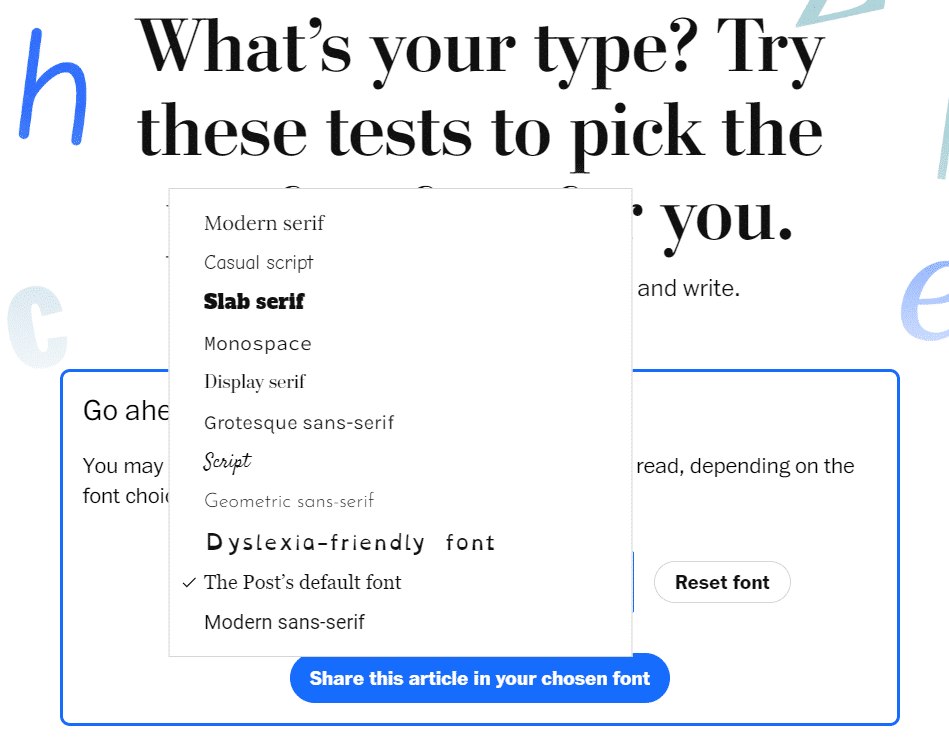
One of the fonts is Dyslexie,a special font for dyslexics to Word and Office that we’ve explained in Office-Watch.
Later in the article there are examples of how font choice can affect readability. How serifs, proportion, contrast, letter spacing and X-height matter.
At the end there’s the simplest advice for font selection: “simpler is better “
Add a special font for dyslexics to Word and Office
Typography 101 – font terms explained
Goldman Sachs font for a new look in Excel, Word and Office
Why the US government is switching to Calibri font