Microsoft’s alternatives for the new Aptos fonts range are very poor. In some cases, the substitutions make no sense at all. We’ve looked at what happens if a document with Aptos fonts is opened Office 2016 and earlier versions of Word, Excel, PowerPoint and Outlook.
Aptos fonts are the new default for Microsoft 365 and are also available in Office 2021 and Office 2019. For earlier versions of Office, there’s a font substitution feature which is supposed to replace a font with another that’s available on that computer. Unfortunately, Office does a very poor job of choosing a replacement.
In short: if you’re sharing a document or slides with someone using older Office, it’s best to embed the fonts in the file because Microsoft font substitution choices are peculiar, to put it kindly.
Same font swapped for the two main Aptos fonts
We made a document with the two main Aptos fonts (Aptos and Aptos Display) and opened the doc in an updated Word 2016. The result was disappointing.
Go to File | Options | Advanced …. to see what fonts in the document are missing and what font Word has chosen instead. In this case both Aptos and Aptos Display (Microsoft 365 only fonts) are replaced with Calibri.

Replacing Aptos with Calibri makes sense. Calibri is the former default font which Aptos is replacing.
But Aptos Display should NOT be substituted with the same font, Calibri! That’s the new headings font and should be replaced with Calibri Light, the old Office headings font.
There’s no excuse for that, Microsoft should do a better job (there are several options available) and have presumably chosen not to.
Here’s the two pairs of fonts for comparison.

But wait … it gets worse
If that wasn’t bad enough, here’s the substituted fonts for all the other Aptos font variations (ExtraBold, Light, Narrow etc.).
All, except one, is replaced with Calibri!

To give you an idea how bad that is, here’s some other Aptos fonts with how they look in Office 2016, reformatted with Calibri.
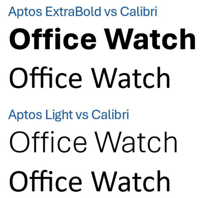
Aptos Narrow (the new Excel default font) is a close match for Calibri but Aptos SemiBold isn’t even close.

(All the examples use 48pt text with no additional settings (e.g. Bold, Italics).)
Not only does Calibri look quite different from the original font, in most cases Calibri uses less horizontal line space (especially Aptos ExtraBold and Aptos SemiBold). That means the text will wrap and possibly also repaginate differently.
Aptos Serif’s strange substitution
Have a look at the replacement for Aptos Serif … an obscure font called Sylfaen …

Sylfaen is a Microsoft font to support Georgian and Armenian script. It’s been installed since Windows 7 and is also available as a cloud font with Microsoft 365 for Mac. It’s a reasonable though unusual substitute for Aptos Serif which might surprise/confuse some people.
Here’s Aptos Serif compared with two well-known serif fonts, Times New Roman (line 2) and Georgia (line 3).

Aptos Mono replaced with Calibri – really?
The absolute worst font substitution is Aptos Mono, a monospace font, replaced with Calibri, a sans-serif proportional font. The font equivalent of ‘apples vs oranges’.

That font substitution is hard to understand. The font details for Aptos Mono in the document says that the font is ‘fixed’ pitch (as opposed to ‘variable’). Nerd note, in fontstyle.xml, Aptos Mono details include <w:pitch w:val="fixed"/> .
How and why is Office ignoring that hint and still choosing Calibri instead of Courier New or some other monospace font?
New Office defaults and Aptos fonts
Surprise! Office 2021 & Office 2019 has the all Aptos fonts
Aptos & Microsoft fonts, what can you legally do with them?
New default font, Aptos, in Microsoft 365 and Word