New Copilot Logo Is Here: Flatter, Simpler and Completely Useless to You
Microsoft has given Copilot a new logo for 2026, a flatter and simpler version of the rainbow icon it has used since September 2023. You will see the new icon appear in the Copilot app, on the Home tab of Word, Excel, PowerPoint and Outlook, and in Microsoft’s marketing. That is the entire change. It will not make Copilot smarter, faster, cheaper or less likely to invent facts, and it does nothing about the Copilot buttons and prompts that get in the way of your work. Here is what changed and what it looks like next to the old versions.
Microsoft has a lot of work ahead of it, trying to get Copilot working in an efficient and compelling way for customers. There’s much to do within Word, Excel, PowerPoint and Outlook to make their AI great and not necessarily in the areas that Microsoft is currently obsessed with.
With so much work to be done, what is Microsoft boasting about? A change in the Copilot logo!
Please contain your excitement as we reveal the latest Copilot logo: 2026 edition. I hope you’re sitting down for this …

We’ll spare you the usual hyperventilating comments that Microsoft fanboys have been issuing about the new logo.
How This Affects Your Office Setup
Absolutely nothing. Nil, nada, not an electronic sausage.
This is barely a cosmetic change that many people won’t even notice. The flatter icon will not make Copilot smarter, faster, or less prone to confidently making things up.
A change in logo does nothing to address the daily user interface hassles and lack of choices with Copilot inside the Microsoft 365 apps. It is a fresh coat of exterior paint on a building that still needs a lot of work inside.
If Microsoft were truly listening to customers about AI, it would know that no one was asking for a new Copilot icon.
How the Copilot logo has changed
The new logo is a simpler, flatter version of the previous one introduced just under three years ago.
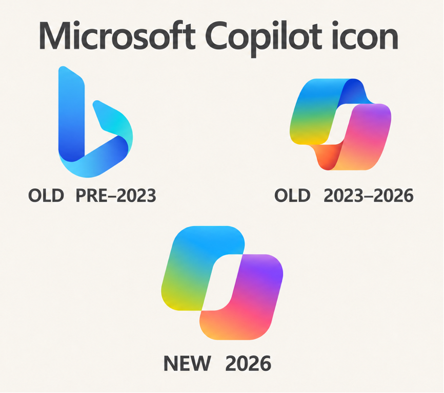
So the arc goes: plain blue then maximum rainbow by September 2023, and now Microsoft is walking it back toward flat and minimal again. That is a lot of design meetings to end up roughly where it started, just easier to draw.
More on Copilot in Word, Excel, PowerPoint and Outlook
If the icon itself is the thing bothering you, the real problem is usually where Microsoft puts it. We cover the floating bubble that buries the Copilot button and floats a nag in its place in every document, sheet and slide, and the rare climbdown when Microsoft cancelled Copilot Search in Outlook, but made the Copilot button bigger.
Want it gone rather than redesigned? Our step by step guide to turning Copilot off in Microsoft 365 for Word, Excel, PowerPoint and Outlook covers the global switch on Windows and Mac, while how to turn Copilot on or off for each Microsoft 365 app explains the per app options.
Under the new paint job, the AI has changed a lot more than the logo has. Copilot Agent Mode now edits your documents directly instead of just suggesting, which is a far bigger deal than any icon.
For the wider picture, our independent guide to what Copilot actually does, its limitations and your choices cuts through the marketing, and Microsoft Slams the Brakes on Copilot, Is Office Next? looks at whether the pullback in Windows will ever reach the Office apps.