AutoComplete in Outlook – all you need to know
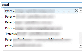
Outlook’s AutoComplete seems simple and useful. It’s certainly useful but it’s hardly simple and occasionally it’s been downright dangerous or embarrassing. AutoComplete makes it too easy to send an email to the wrong address. We’ll look at AutoComplete, how it works, the pitfalls and the few settings available. First we’ll cover the basics (that you […]