The Office.com home page is being updated or rather rearranged. The changed page has been described as ‘beautiful’ and ‘great’.
The changes are gradually rolling out to enterprise Office 365 customers, presumably consumer Office 365 Home/Personal users will see the change a little later.
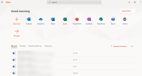
The current Office.com page looks like this with the program icons across the top. Document lists; Recent , Pinned, Shared with Me and Discover are below that.

Clicking the + symbol (Start new) opens a pop-up window to choose a new document to create.

The new look moves the app icons to the left-side, down the page. The app icons are the same as the current page, the latest revision of the Office icons.

Source: Aggiornamenti Lumia
Recently opened documents get more prominence with thumbnails at the top.
Clicking the + icon opens a Create New menu listing the Office document types including two Forms (Survey and Quiz) and Sway. The same selection of new documents, shown in a different way.
There are some small design changes like shadows when hovering over icons however the overall look is the same as the previous design. Same color scheme and choices.
For all the gushing praise, the changes are a rearrangement of existing options. There’s now more room to see active documents over program icons. That’s probably a good thing and more useful to customers.
Unpacking a big day for Office 365 / Microsoft 365
Goodbye Office 365, Welcome Microsoft 365
Office 365 Chrome extension – yawn
New Office icons start appearing … yawn