A strange case of letter spacing with a Microsoft font showing differences between Word and PowerPoint. Here’s the anomaly with three possible fixes for it and similar situations.
Office Watcher Paul B noticed this peculiar spacing between a fullstop/period and digit 1 with the Tenorite font. In PowerPoint, the two characters are very close together but in Word they are positioned further apart.

It’s strange that there’s a spacing difference between Word and PowerPoint for the same letters/font combination. Presumably there’s some anomaly in the kerning information that comes with the Tenorite font.
Tenorite was one of the candidate fonts released by Microsoft in 2021 as proposed replacements for Calibri.
Looking at various fonts in PowerPoint shows some variations when .1 are together, as in a date separated with fullstops.
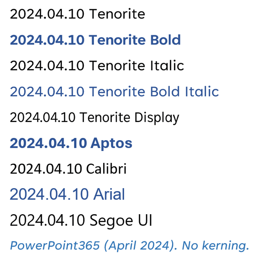
In these examples, Tenorite looks OK but there’s a noticeable gap between . and 1 in Aptos, Arial and arguably Segoe UI.
Maybe it’s Tenorite font kerning problem or something in PowerPoint that misinterprets the font kerning settings. Since Word looks OK with the same font/character combination, the smart money is on some PowerPoint anomaly.
These little kerning / spacing issues show up occasionally, though at lot less often than they used to. Happily there are little tweaks available to fix character spacing problems.
The fixes
For this situation or other kerning anomalies there are three possible fixes:
Turn on/off kerning
The kerning setting may or may not be affecting the character spacing. Select the text then go to Home | Font Setting (the little arrow at bottom-right of the Font block) | Character Spacing then toggle the Kerning option to see if it makes any difference.
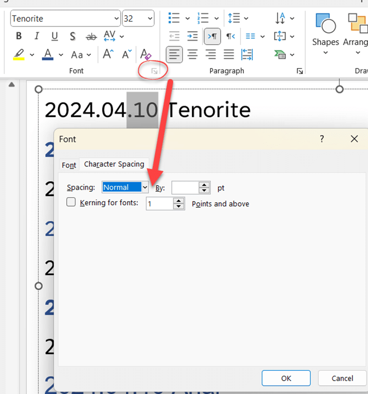
Change character spacing
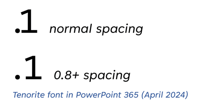
A subtle change to the character spacing will change the gap between characters. Select the two characters then go to Home | Font Setting (the little arrow at bottom-right of the Font block) | Character Spacing and change the spacing to Expanded and some small value. In this case we settled on 0.8pt
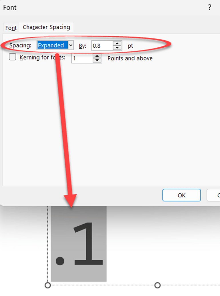
That small change is enough to position the two characters better.
If the characters are too far apart, choose Condensed character spacing with a negative spacing value.
Switch to another font
Or change to another font that doesn’t have the same spacing problem.
Fix The kerning Settings In Microsoft Word And Office