Kerning is a font setting that’s important in Word and PowerPoint. We’ll explain kerning and why you mostly don’t have to worry about it except for large size text like titles and headings.
Kerning adjusts the horizontal space between letters so they look right to the human eye. It’s necessary because letters take up different amounts of space and the letter shape can clash with the ones either side.
At Office-Watch.com often one topic leads to another. Our ‘2001: A Space Odyssey’ design article got feedback from two readers about the kerning in our remake of the title card. That got us looking at kerning generally. We’ll return to 2001 kerning in a follow up article.
We’ll show you why kerning is important, the difference between positive and negative kerning, why size matters and why us humans are to blame for kerning. Also how to choose fonts with better kerning.
For font novices, issues like kerning can seem mysterious. It’s hard to see the differences that font experts are talking about. Once you understand kerning, you start seeing kerning and especially bad kerning everywhere.
We’ll try to make the differences clear but if you know a bit about fonts you might like to skip to 2001: A Space Odyssey and kerning and Kerning settings in Microsoft Office.
Letter widths
It’s easy to think of each letter being in a little box separate from others. That’s the way it is with a fixed space or typewriter font like Courier New

We’ve put a copy of the word at right with lines to show that each letter is in its own space with no overlap.
It’s different for most fonts we use today. They are proportional fonts like the common Office font, Arial. Proportional fonts have a different amount of horizontal space for each letter – for example the letter I takes up less space along a line than A, X or W .
Visible gaps between letters
Have a close look at the gap between the A and Y in the fixed font example – it looks a little ‘off’.

That’s because the right diagonal of the second A leaves a lot of space to the right of the letter … meantime the left diagonal on the Y leaves space on the left of the letter. That means there’s a visible gap for that combination of letters.
Look at the gap between the A and W … you’d think it would have the same problem as AY (ie diagonals leaving a large gap) if not worse. The font designer has made the capital W with more vertical aligned strokes to avoid that problem.
Proportional fonts have the same problem but it’s more obvious with a fixed space font. That’s why we used Courier New for the example above. Here’s Arial font with no kerning, each letter is in it’s own ‘box’ with the same gap between A and Y .

The solution is kerning
Kerning tries to fix these ‘gap’ problems between letters by shifting certain letter combinations.
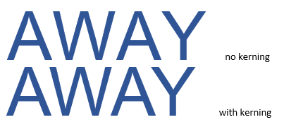
Here again is Arial but this time without and with kerning so the difference (hopefully) is more obvious.

Negative Kerning is that overlapping of letters aka removing that horizontal gap.
The letters are the same size, but the kerned word takes up less space along the line because all three letter combinations have kerning.
Look again at the final A Y combination, the two letters now overlap each other to eliminate the visible gap.

We’ve drawn vertical lines down from the leftmost tip of the Y so you can see the kerning difference. In the kerned letters, the Y begins in the space already used by the A.
Closing those gaps make the four letters appear together as a single word, not a set of individual letters.
We chose the sample word AWAY because all three letter combinations (AW, WA and AY) need kerning.
Positive and Contextual kerning
We’ve demonstrated above negative kerning but there are other types of kerning: Positive, Contextual, Manual and Automatic kerning.
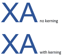
Positive kerning adds space between letters to ensure we see the two as distinct characters. The combination XA has a slight positive kerning (ie greater gap .

Look carefully or take our word for it, that MS Word has added a slight gap between the X and A in the kerned example.
Contextual kerning is something beyond the scope of Microsoft Office. We mention it here for the sake of completeness. Its more complicated because it considers combinations of three or more letters and is done manually. This kerned example in Baskerville Old Face font has joined up the bases of each letter, making it hard to visually separate the letters. Contextual kerning would fix that.

Automatic or Manual kerning
Automatic kerning is what we’re talking about here. Microsoft Office takes the kerning information in the font and calculates the kerning necessary in Word, PowerPoint or Excel.
More sophisticated graphics packages allow for manual kerning or adjustment.
See our look at the title for 2001: A Space Odyssey for an example of Office’s automatic kerning vs manual kerning.
Humans are to blame
Kerning fixes a problem with how we humans perceive text.
Ideally, there would be nothing wrong with letters spaced equally but our brains don’t work that way. Without kerning our brains might not as easily group letters together into words and sentences. Each person’s brain processes the image in a slightly different way … at one extreme end you have people with dyslexia.
To some extent, kerning is an issue of design and taste. Detailed analysis of a font by experts can get down to a question of artistic preference rather than a simple ‘wrong or right’ judgement. As a result, it’s not a simple thing for computers to do by calculation. There’s a level of subjective or artistic judgement involved.
Size matters
Kerning becomes an issue as the font size increases. With smaller text, the letter gaps are so tiny that they don’t make much or any difference.
Kerning issues depend on the letter combination and the shape of the letters in that font.
How kerning is done
Each proportional font in Windows has kerning information.
TrueType fonts (.ttf) need each Letter, number and symbol combination to be individually considered and the kerning decided upon.
A full kerning table isn’t practical for all combinations. A very basic font with just 62 letters plus numbers (no punctuation or special symbols) has 3,782 character combinations. A full ASCII font has over 64,000 combinations. Don’t even think about the needs of a full Unicode font with over 136,000 characters with over 18 billion possible combinations!
Most kerning information covers the commonly occurring combinations but might skip the rarer combinations. That’s more of an issue with free fonts made by individuals. You’d expect better and more extensive kerning info in a commercial font. The fonts supplied by Microsoft should have good kerning.
OpenType fonts (.otf) have been available since Windows 2000. They can use a different kerning method called a Glyph Positioning Table. Each character (glyph) comes with information on the left/right spacing that software can use to automatically kern with. The result is a smaller and more flexible font.
What type of font is best for kerning?
For regular users it’s better to use an OpenType (.otf) font whenever possible. OpenType can take advantage of better kerning among other typographical improvements.
Kerning settings in Microsoft Office
2001 movie design: using in Office, Word or PowerPoint
2001: A Space Odyssey and font kerning
2001 A Space Odyssey – in Word and PowerPoint