How to use the font kerning settings in Microsoft Office, Word and PowerPoint and fix the default setting for Heading styles in Word.
Kerning letters makes a difference as the letters get larger so the setting is more important for headings and titles in Word and PowerPoint. Here’s common Arial font without and with kerning showing why kerning is important as the letters get larger.

See our short guide to kerning to understand the settings and artistry behind kerning.
Windows and Mac defaults are wrong
Kerning is available in Word and PowerPoint, Office for Windows and Mac. However their default kerning for Heading styles is very strange and probably worth changing.
Headings are usually larger text and that’s when kerning starts fixing strange letter positioning. For many years Microsoft Word has the strange choice by NOT using kerning on the default heading fonts, which is the place where kerning would be most useful. Here’s the default for Heading 1 style in Word 2016 with kerning OFF.

Maybe Redmond decided that kerning doesn’t make enough difference with the default ‘Heading n’ styles? It was a strange oversight that Office Watch recommended a change to turning Kerning on for fonts above, say, 12pt or 20pt.
Since then at some time in the last few years, the default Heading style kerning setting was quietly changed, now it’s on but set to work for all sizes from 1pt upwards. Here’s the default in Word 365.

It’s almost as if Microsoft overcorrected from having no kerning to forcing it for all Headings. You might want change that setting to, say 12pt or 20pt and above. Admittedly, headings are rarely in smaller font sizes anyway.
Font | Advanced
To setup kerning you need the Advanced Font settings. Click on the little arrow on the bottom right of the Home | Font ribbon section.

In Office for Mac, go to the menu Format | Font or Command + D to open the Font dialog.
In Office, the kerning setting is applied for font sizes higher than the size you specify. At Font | Advanced | Kerning for fonts … points and above.

This type of setting is very useful because you can ‘set and forget’. It will work when the font size requires it, but you don’t have to worry about Office kerning if you switch to a smaller size.
When to use kerning?
When to use kerning and what size to start using kerning isn’t a simple question.
It partly depends on the font. Fonts have different needs for kerning and older TrueType fonts might be less able to kern properly compared to OpenType fonts. Good fonts have kerning information that software can use to position characters.
Size of the font also matters. Smaller/body text doesn’t need kerning, it’s only as the size increases.
The beauty of the ‘Kerning for fonts …. Points and above’ is that you can set a lower limit for kerning then forget about it.
If you want a very broad or rough ‘rule of thumb’, set kerning for 20 points and above. Microsoft’s default is 12 points and higher.
Styles
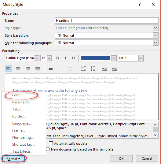
The same setting is available for any style under Modify Style | Format | Font | Advanced.
Kerning text simply explained for Word and Powerpoint
2001 movie design: using in Office, Word or PowerPoint
2001: A Space Odyssey and font kerning
2001 A Space Odyssey – in Word and PowerPoint