Microsoft has rolled out a refreshed design for comments in Microsoft Word, for now just the web version. It changes how feedback and discussion appear inside documents. The updated interface features revamped icons, buttons and, most importantly, when you select a comment it lights up, while unselected comments fade to muted gray. A small update, but one that’s especially helpful in documents with many comments or long review threads.
The comments interface has been redesigned. There are revamped icons/buttons, an overall more modern layout but most importantly it’s a lot easier to see the current, selected comment.
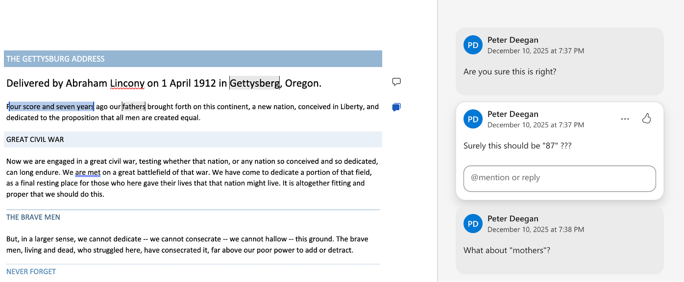
A selected comment you select lights up, while non‑selected comments fade into subtle gray. A chosen comment is still highlighted in the text.
This change has rolled out to Word on the web (browser based Word). If the change doesn’t appear for you now, it will soon.
This improved readability helps when you have lots of comments or long threads; the new design lets you quickly zero in on the comment that matters.
Microsoft calls this a “a cleaner, more modern design” but that’s what they say about almost every change in the look & feel of their software.
Here’s how the new look Comments appear in Word on the web.
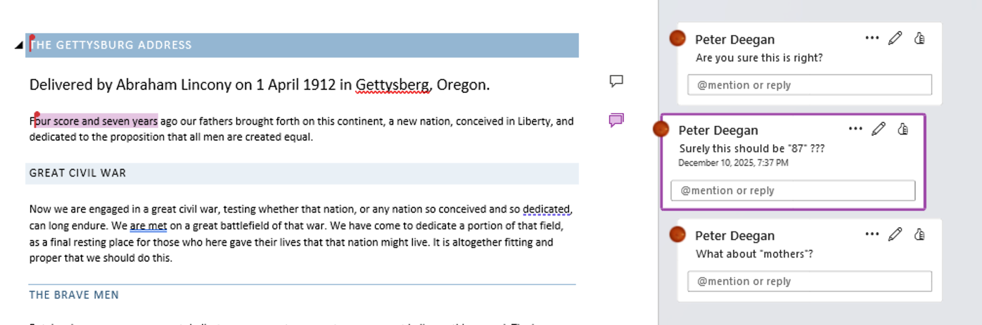
Compare the new Word for web look for comments with the same document in Word 365. All the right-side comments look much the same with the selected comment indented a little plus a border.
Overall, a slight improvement in how Word Comments are displayed.