Microsoft Office has many benefits for its millions of users and there’s scientific evidence that Office features can make you appear smarter … truly.
Simpler words make you seem smarter
It’s an old student trick to use bigger words in an effort to impress the teacher but it doesn’t really work.
A 2005 study compared two versions of a sociology essay. One had been ‘simplified’ with Microsoft Word 2000’s thesaurus. Words longer than 8 letters were shortened using the Word thesaurus (the second shortest alternative word was chosen).
The readers of the simplified essay judged it as less complex than the original but the writer as more intelligent. Or, in the words of the study there’s “a negative relationship between complexity and judged intelligence“.
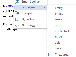
If you want your writing to be clearer and people think you’re smarter, right-click on long words and choose Synonyms
The study also found that “texts in hard to read fonts are judged to come from less intelligent authors”. Yet another reason to avoid the dreaded Comic Sans <g>.
You have to love the Daniel Oppenheimer’s entirely appropriate title for his study “Consequences of erudite vernacular utilized irrespective of necessity: problems with using long words needlessly“.
Charts are more persuasive and make you seem smarter.
In a somewhat similar 2014 study, graphs vs words were compared for presenting information.
It’s well known that graphs and charts help people understand data better than a table of values. But the study found that even small, almost pointless, graphs are persuasive and make the author appear more ‘scientific’ (ie smarter) than they are.
The Chart features in Word, Excel and PowerPoint aren’t just there to ‘pad out’ a document … use them to seem smarter and get your point across.
Two groups were presented with information about a drug trial with a comparison between the control group and the drugged group including the statement “… trials it conducted demonstrated a drop of forty percent (from eighty seven to forty seven percent) in occurrence of the common cold.” One group was also shown this trivial table:
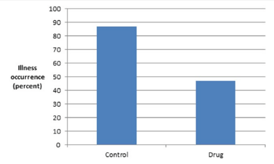
Source: Public Understanding of Science
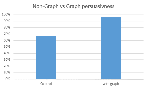
96% of the group who saw the graph thought the drug would reduce illness. Only 67% of the non-graph group thought the same thing. Or, to put it another way ….
This appears to be related to the readers ‘belief’ in science. The more than someone accepts science and scientific method, the more likely they are to be swayed by a graph.
As Aner Tal and Brian Wansink say “even trivial elements can increase public persuasion despite their not truly indicating scientific expertise or objective support“.
Tip of the hat to The Independent.