Microsoft has upgraded the Accessibility Assistant in PowerPoint for Microsoft 365 to detect color contrast issues on transparent backgrounds, not just solid-colored ones. Until now, if your slide text sat on top of an image, gradient, or layered visual, PowerPoint’s checker could miss real readability problems entirely. The tool now evaluates contrast against what your audience can actually see. For anyone who builds slides with photos, branded backgrounds, or design-heavy layouts, this is a meaningful improvement.
If you create presentations with photos or designed backgrounds, run the Accessibility checks before you share your next deck. You may find problems that the old checker completely missed. This is especially worth doing if your organization has accessibility requirements or if your slides go to a broad audience.
What Was Broken Before
Most text boxes in PowerPoint are transparent by default. That sounds fine until you drop white text over a photo of a snowy mountain, or light gray text over a pale gradient. The old Accessibility Assistant only checked contrast when text sat on a solid color background. If the background was transparent (even though something was visually behind it), the checker simply skipped it. Real contrast problems went undetected.
What Has Changed
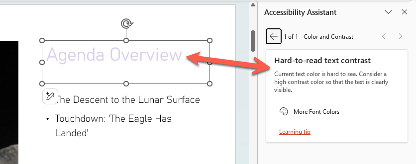
Accessibility Assistant now checks the contrast of text against the background you can actually see, even when that background includes transparency.
In plain terms, it looks at what the slide actually looks like on screen, not just what the text box properties say.
This means it will now flag text that is hard to read over photos, gradients, and layered slide elements. People with low vision or color vision differences are the main beneficiaries, but anyone who has squinted at a slide with low contrast text has felt this pain.
How to Use It
The tool is in the same place as always:
Review | Check Accessibility in the side-pane look for Hard-to-read text contrast warnings.
Text boxes with transparency will now be evaluated and flagged if the contrast is insufficient.
What It Still Misses
Two known gaps remain: the improved checking does not yet apply to text inside tables without a solid fill, or to text inside native Chart objects such as legends and data callouts. Those are common places for small, hard to read text, so expect a follow up fix at some point. For now, check those areas manually.
Who Gets it?
Microsoft 365 subscribers running Windows v2603 build 19822.20114 or later, and Mac v16.108 build 26032513 or later.
This is currently an Insider rollout, meaning it will reach general Microsoft 365 users over time. If you do not see it yet, it is on the way.
Using Inspect without Color in PowerPoint to Improve Your Slides
Fixing Common Office Document Accessibility Problems
Check Accessibility Problems as You Work in Word, Excel and PowerPoint
How to Use Excel’s Accessibility Ribbon
Microsoft Redefines “Red” for Better Accessibility in Word, PowerPoint, and Outlook
Accessibility Checker and Document Conversion in Office 365