Microsoft is changing the way Word’s Read Mode and Outlook’s Reading Pane looks but it’s hard to know what they’re doing because there’s a lot of oversold hype but little detail.
These changes were announced more than two weeks ago and still haven’t appeared on any of our test machines. That’s important because Microsoft’s blog post has NOT provided any examples to show how the ‘Advanced Reading Technology’ will improve document or email display.
What we know
Stripping away all of Microsoft’s ‘pablum’, this is what we know:
- The change only applies in Read Mode (Word) or Reading Pane (Outlook).
- No change in other views like Print or Web layout and not a printed/PDF document.
- We’re told that the changes add “intelligent, adaptive justification, kerning, and OpenType ligatures “.
- ‘adaptive justification’ … Microsoft explanation is below.
- Kerning and OpenType Ligatures have been Word features for some years. Microsoft’s explanation, below, is merely a description of those long-standing features with nothing new.
- Layout changes won’t be major and will only happen when “our layout scoring algorithm determines that they will improve the layout”.
- You can turn the features off, but not directly from Read Mode. The switches are buried away in Options | Advanced rather than a toggle on the Read Mode menu.
What’s changing?
This is Microsoft’s “explanation” of the changes to Read Mode/Reading Pane.
At least this explains what ‘adaptive justification’ does, we’ve highlighted the relevant text.
- “Full justification with adaptive, optimal paragraph algorithm. Full justification is one of the hallmarks of fine typography, and is present in most professional books, magazines, and editorial design. Aligning the text on both the right and left creates a clear box of the text, which in turn reinforces the graphic organization and underlying structure of the page. Good justification is difficult to get right: badly justified text can lead to rivers of whitespace that can be distracting. To eliminate these issues, we are using a highly tuned “optimal paragraph” algorithm which evaluates many ways of laying out each line in a paragraph, and chooses the layout with the most even arrangement of whitespace over the whole paragraph. Our justification algorithm uses not only spaces between words but also inter-letter spacing. Our algorithm doesn’t force justification, either – if it determines that the text would look better without justification, it’ll automatically leave it off.”
But the other two ‘new’ features are merely descriptions of the existing kerning and ligatures features in Office.
- “OpenType kerning. If all letters were simply rectangles, typography would be easy. Letters (hypothetical rectangles) would line up next to each other and have exactly the same visual space between them. But letters are irregular. The capital T has a bunch of white space under it and if you just arranged letters based on their edges, then the word “Typography” would look more like “T ypography”. Kerning adjusts the spacing between specific pairs to make them fit better visually. Another good example, consider the word “MUSTARD.” The capital letter A has the opposite problem to the capital letter T – it has a lot of space above it. Put them together with kerning, and the A tucks nicely under the T. Without kerning, it looks more like “MUST ARD”, which might slow readers thinking that it’s two words. Matthew Butterick’s Practical Typography site has many more examples.
- OpenType ligatures. The irregular shapes of letters can sometimes clash with each other. For example, the hook on the lowercase f can smash into the dot on the i or j. The tail of a y can crash into a preceding g in “edgy.” Ligatures are a way of substituting two or more characters with a single combined letter that is specifically drawn for that case. The Practical Typography site has many examples.”
Perhaps kerning and ligatures are being automatically applied in Read Mode? If so, that raises a lot of questions. Customers should not have to guess because Microsoft should be a LOT clearer about what they have done.
Possibly these changes are for the better however it’s hard to know when Microsoft just pushes out marketing platitudes instead of proper documentation.
What about WYSIWYG?
Has Microsoft forgotten the idea of WYSIWYG? There’s no mention of how some customers might be confused when the details of their document look different with on-screen Read Mode compared to other layout views, a PDF or printed version. For example, trying to understand why there’s a ‘funny character’ (ligature) on the screen and not on the printed page.
Overhyped
Whatever the Read Mode changes turn out to be, they are relatively minor and may go unnoticed by many. Even by Microsoft’s standards their promotion of these changes is ‘over the top’ if not outright nonsense.
Take these two tweets from an official Microsoft account.
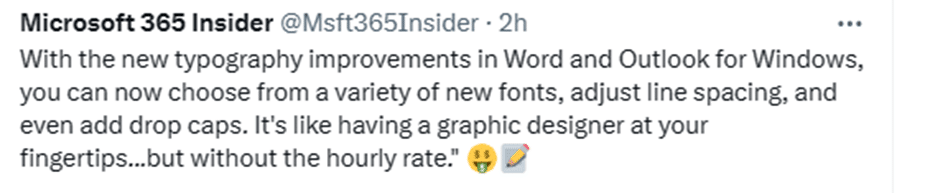
Word and Outlook have line spacing and drop caps for a long time. They are hardly new. We’re not sure what ‘new fonts’ Microsoft is talking about. The linked blog page has no mention of any ‘new fonts’ or line spacing or drop caps. It’s like they are talking about another part of Word entirely.
Then there was this tweet last week. We’ve read through the description of the changing Read Mode and can’t see anything that would make for ‘persuasive and engaging content’.

Who gets it?
According to Microsoft it’s available to Word 365 for Windows Beta Insiders on v2312 build 17116.20000 or later.
But that’s not true. We’ve heard from many Insiders who have later builds but none of the advertised changes. Others are seeing it in Outlook 365 but not Word 365 on the same machine.
Maybe this is a gradual rollout to an increasing percentage of Insiders? If so, Microsoft is usually clear about that with their twee “It’s not you, it’s us” wording.
All up, this is an overhyped and poorly documented feature rollout. We’re not sure if that’s deliberate or not. We are sure that the lack of examples and proper explanations doesn’t help anyone.
At the very least, Microsoft could post from before/after images to show the changes made in Read Mode/Preview. Even better, share some sample Word documents that will show off the typography changes (the development team have hundreds).
Make fancy text with OpenType Ligatures in Word
Kerning text simply explained for Word and Powerpoint
2001: A Space Odyssey and font kerning
Fix the kerning settings in Microsoft Office
Word for iPhone gets reading mode
Two ways to read PDF files on an iPad