Microsoft has added a Copilot floating button to Word, Excel and PowerPoint, parking a persistent icon in the bottom right corner of every document, spreadsheet and slide. New shortcuts make Copilot easier to reach, but there is no off switch. Here is what changed, what disappeared, and why this is a sales tool dressed up as a design upgrade.
We’ve already talked about Microsoft’s latest way to push Copilot into customers’ work with a compulsory button (bug) at bottom right of every document, sheet or slide. Here’s why Microsoft thinks it’s better.
After cluttering Word, Excel and PowerPoint with Copilot buttons scattered across ribbons, toolbars and menus, Microsoft decided maybe one button is enough. Unfortunately, they put that single button where it would most annoy paying customers.
The entire change is being sold as a major design overhaul. The button on the Home tab (which matches Microsoft’s own Office interface rules) is now an ‘in workspace’ icon you cannot avoid.
Contextual Prompt
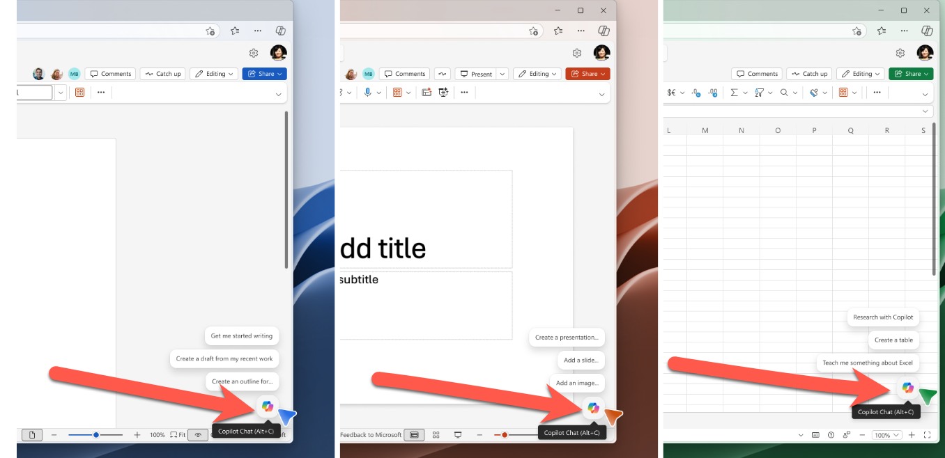
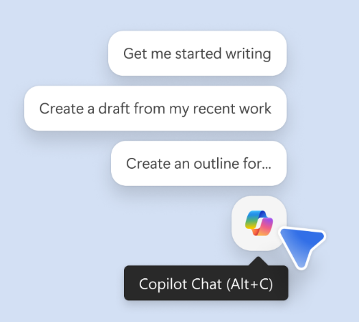
Copilot now lives in a fixed spot in the bottom right corner of your canvas. Hover over it, or tab to it with the keyboard, and it serves up proactive suggestions based on whatever you happen to be doing.
Microsoft calls this helpful. A more honest word is nagware.
The suggestions scale with your text selection:
- Nothing selected: vague drafting prompts (“what to write”)
- A paragraph selected: rewording and tone tweaks (“how it is written”)
- A sentence or word selected: targeted fixes (“whether it is ready to share”)
In practice, it means Copilot is always whispering something at you, and the smaller your selection, the more confident the whisper. Not necessarily right or appropriate, just confident.
New Copilot Shortcuts
The new Copilot ‘bug’ comes with new shortcuts:
Windows and Web – Alt + C
Mac – Cmd + Control + I
All platforms – F6
For now, the shortcuts only work on the latest builds of Word and Outlook for Windows and Mac. Other apps will follow.
Three shortcuts to memorize, one to forget
- Alt + C (Windows) or Cmd + Control + I (Mac): opens Copilot
- F6: jumps focus to the Copilot button.
- Up arrow: walks through the suggested prompts once Copilot is focused
The Copilot button has been removed from the Home tab which means the keytip doesn’t work anymore.
The floating button is in your way
The Copilot icon parked on the bottom right of your document is bound to cover something important, especially in Excel where data tends to live in that exact corner. Microsoft’s solution is, predictably, half-baked:
- Right click the Copilot icon and pick Dock to shove it to the edge.
- Drag to dock, where you simply drag the icon out of the way, is promised “coming soon.”
There is no toggle to hide the icon entirely. If you do not want Copilot on your screen, your only option is to dock it. Though it’ll reappear for the next document.
What’s gone
Copilot button on the Home tab has gone along with twenty years of Microsoft’s own ribbon interface rules.
Copilot in the Word margin has disappeared. I used to dislike that icon but prefer it over this latest sales pitch from Microsoft. At least the Copilot margin icon was discreet and next to the relevant text. The new bug is way over the other side of a Word document from where most people are looking (for left to right readers).
Who gets it
The new button and shortcuts are rolling out to Word, Excel and PowerPoint for Windows and Mac now. Web users must wait a little. General availability is early June 2026.
On Windows you need Microsoft 365 v2606 build 19822.20182 or later.
The Alt + C and Cmd + Control + I shortcuts are already working in Outlook and Word, but only in English on Windows and Mac. Other languages and apps will arrive “shortly.” Microsoft’s definition of “shortly” varies.
This is a marketing button, not a user request
Unifying Alt + C across Windows apps is overdue and welcome. The Mac shortcut is clumsy.
Proactive suggestions are a nice idea but the way they are presented is intrusive and annoying.
The rest is harder to defend.
The prominent Copilot ‘bug’ is not there because users begged for it. If anything, customers are pleading for a more discreet Copilot.
A persistent floating button is not a neutral design choice. It is a sales tool for a paid feature. The redesign is engineered to remind you, constantly, that you are paying for Copilot or should be paying for more Copilot.
If Microsoft genuinely wanted to put users first, there would be a one click setting to switch the icon off. There is not because Microsoft’s needs are more important than those of it’s paying customers.
Microsoft buries the Copilot button and floats a nag in its place
Microsoft 365 Classic Explained: A Lower Cost, No AI Subscription Option
Keytips: Microsoft Office Shortcuts
What the !@^? Is Microsoft Copilot “Work IQ”?
Build a Better Excel Workbook with Copilot: Smarter Prompts, Stronger Results
Smart Measurement Conversion: Clever Copilot in Excel
Why AI Is Almost Intelligent: The Honest Truth About ChatGPT and Copilot