There are better ways to chart differences between matching values like budget vs actual than the simplistic one offered by Excel. A variance chart in Excel shows differences and trends at a glance and is easy to make.
In Excel, a variance chart visually compares data sets, such as actual performance versus budget, last year vs this year, two stores or departments. This makes it easier to identify areas where performance differs from expectations or the past.
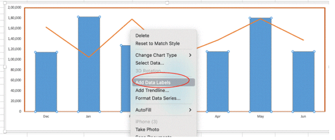
The simple way to show the difference between pairs of values is a simple bar chart like this one recommended by Excel automatically.
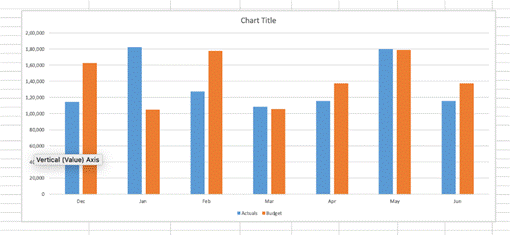
That’s OK but there are better ways to show the differences and trends with a variance Excel chart. With these two charts, it’s easier to see that only one month exceeded budget and two matched budget.
A well-designed chart captures attention instantly. Customizing colors, themes, and layouts enhances its visual appeal and engagement. You can emphasize key data points, trends, or patterns by adjusting legends, using distinct colors, adding annotations, or modifying line thickness.
These charts are valuable in multiple scenarios, such as sales analysis, expense comparisons, and project timeline tracking. Their primary purpose is to clearly and efficiently highlight deviations. When analyzing actuals versus budget, the clustered column chart is the most widely used, with metrics represented as columns.
Inserting a Clustered Column Chart
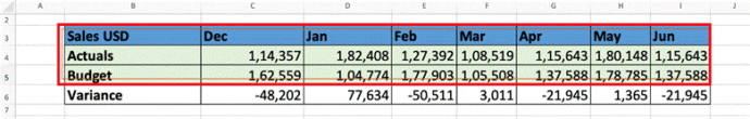
To create a clustered chart, start by selecting the data without any variance column.
Navigate to Insert | Recommended Chart and select the Clustered Column
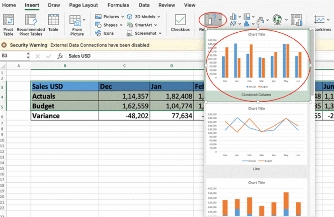
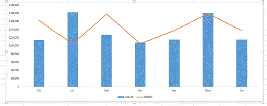
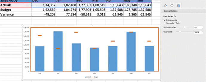
You can now see charts displaying Actual vs Budget side by side.
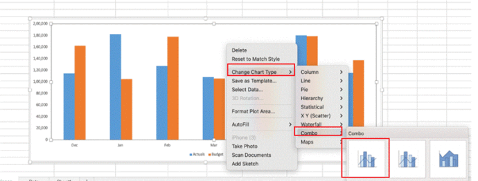
Change to Combo chart
Now change one of the data elements (e.g. Budget) from a column to a line chart overlay.
To begin, right-click on the chart and select Change Chart Type. Alternatively, navigate to the Chart Design tab and click on Change Chart Type from the drop-down menu. Next, select the Combo Chart option and choose Line Chart for the desired data series.
That converts one set of bars to a line like this:
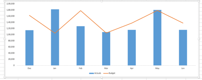
Of course, you could do it the other way around with the Budget values in the column and Actuals as the line.
More chart options
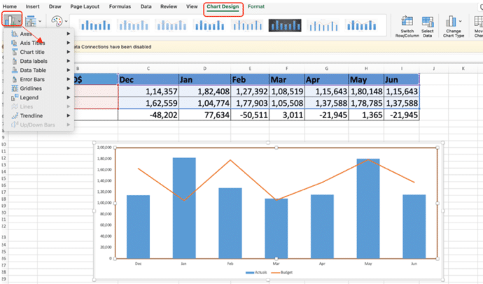
For further customization of your chart, go to the Chart Design tab and click on Add Chart Elements to include any of the following: labels, legends, data labels, gridlines, trendlines, or axis titles.
Format for Better Visibility
How you want to format your variance chart depends upon you. If you decide to go with a bar chart you can format positive values (blue) and negative values (red). You can enhance the visual appeal by using either Gradient FillorSolid Fill for your chart elements.
For a line chart, you can position positive values above and negative values below for clarity. You can achieve this by performing a Right-click on the chart and selecting Add Data Labels.
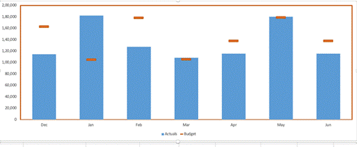
Change Line chart to markers only
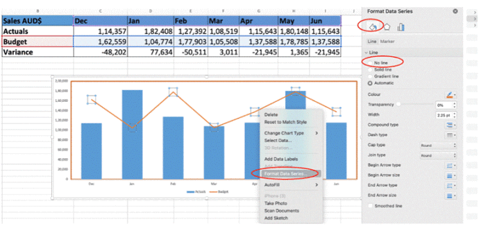
Let’s change the line series by removing the connecting line and making each data point (marker) bigger and different.
Select the line chart, then click on Format Data Series. Next, go to the Paint (Fill & Line) option and customize the line’s appearance as needed.
Click on the “No Line“ option to remove the line from the chart.
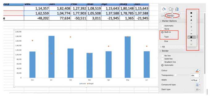
Once the line disappears next you can modify the marker settings by selecting the automatic option. You should now see the red points on the chart instead of the line.
Not only that, but you also have the option to customize the shape by selecting your preferred shape type under the “Type“ option in the “Built-in” section.
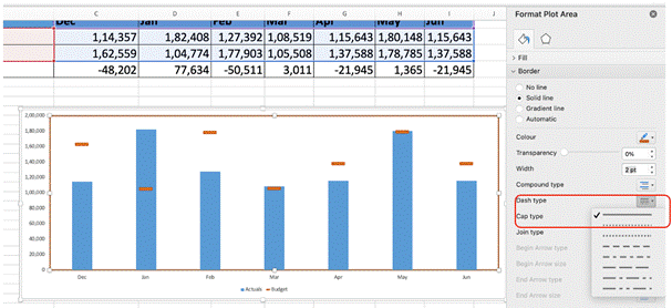
You can adjust the size of the selected (–) shape and change its color by selecting the respective size and color options.
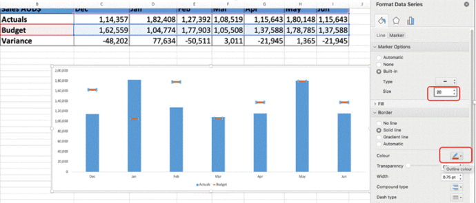
Moreover, you can also modify the widthandtype of the shape by selecting the “Compound Type” option. To customize the dash design in the chart, choose your preferred style under the “Dash Type“ option. Modify the width to 2 pts or any size of your choice.
Adjust Axis Labels
You can easily adjust the gap width of the primary axis. Right-click on the Primary Axis and select Format Data Series. From there, locate the Gap Width option and let’s set it to 100. Ensure the changes are clear and visually distinguishable.
Your variance chart is now ready! Variance chart simplifies the comparison between budget and actuals, highlighting variances to identify performance gaps effectively.
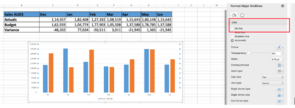
Remove Gridlines
Optionally, eliminate unwanted gridlines by selecting the gridlines, navigating to the “Format Grid” options, and choosing “No Line” under Line settings.
Auto updating your Excel Charts