Yet more examples of strangeness and inconsistencies with Excel Map Charts with some unexpected workarounds.
When Bing ‘accidently’ dropped images of the Tiananmen Square ‘Tank Man’ (not the first time such politically convenient ‘bugs’ have creeped into Bing). It made us wonder how Excel Map Charts (a Bing cloud service) handles the diplomatically thorny issue of China vs Taiwan.
We did discover more annoyances and inconsistencies in Map Charts. It’s another example of the bugs in Excel 365 Map Charts and how to work around them.
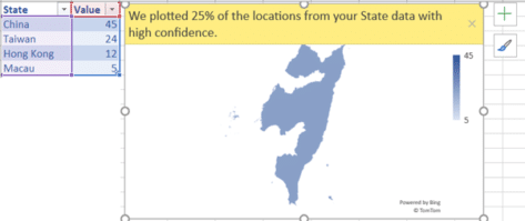
Let’s start with a simple table (the values are meaningless) with China and it’s three external territories (from Beijing’s POV). Map Charts can only ‘see’ one of the four but there’s no way to tell which one it is.
This is long-standing problem with Excel Map Charts that we’ve mentioned before.
“We plotted nn% of the locations from your State data with high confidence.”
It gives a largely useless error message which doesn’t indicate what locations aren’t accepted, in this case one of the four are accepted but which one? Users are left to figure it out, step-by-step which locations are accepted. In this case, the map isn’t any help because we have no idea what the image is supposed to represent. It looks nothing like any of the four locations even if you stand on your head and squint.
One by one
For such a small table, the easiest approach is to add each row, one by one. That should show which entries are causing Bing Map Charts confusion. Note we said ‘should’.
China with Taiwan shows up OK with both ‘areas’.

Same goes for table with map chart for China with Taiwan and Hong Kong.
‘Honkers’ is too small to appear on the map but it’s there.

But adding ‘Macau’ the former Portuguese territory makes Excel Map Charts go haywire.

We’re back to the strange and mysterious map but there’s a big difference.
This table has the same four locations as the first example, now there’s no ‘plotting’ errors. In other words, Map Charts has now recognized all four locations when added individually, but could not when the four rows were loaded at the same time! Go figure.
It’s just an example of the strangeness and bugs that stay in Excel Map Charts. It seems Microsoft has made no effort to improve the service beyond doing enough to boast about the feature.
When we added the ‘Macau’ row Excel 365 offered to convert the labels into the new ‘Location’ data type (not the older Geography data type). It made no difference to Map Charts because Linked Data Types are a totally different cloud service.
We did try the alternative spelling ‘Macao’ but it made no difference.
What to do?
If you strike a problem like this, all you can do it try adding rows/locations in different orders and hope Bing and Map Charts will come good.
Beware, your location can affect Map Charts in Excel
Excel Map Charts are way overdue for fixes
Get COVID-19 vaccination stats and more from Excel
Saving an Excel Chart as a Template
Don’t trust Excel’s Linked Data Types, always verify