Open and close your presentation with a look from a galaxy far, far away or at least a Star Wars movie near you. Here’s the fonts, colors, background and other details to emulate the opening and closing credits.
Star Wars in the Office dictionary
Opening Credits
A long time ago in a galaxy far, far away….
The very first screen is very simple for any PowerPoint user. All we need to tell you are some settings and details.
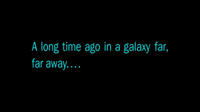
Source: Episode IV, A New Hope 1977, Blu-ray transfer.
In PowerPoint make a slide with a black background then insert a text box positioned in the center of the slide.
Font
Font: the original is believed to be ITC Franklin Gothic or something very near that.
Windows/Mac/Office has Franklin Gothic Book and is close enough for most people, slightly shorter height than the original.
Color
Color: RGB: 41, 238, 247 or #29EEF7
- New line at the end of first line, after the comma.
- No space between ‘away’ and the four dots at the end of the second line.
- Select both lines and change Paragraph | Line Spacing | Multiple to 1.1 .
End Credits
The end credits might seem the same as the famous opening frames but there are crucial differences.
There’s a star field background, the color and font have also changed.
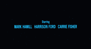
Source: Episode IV, A New Hope 1977, same Blu-ray transfer as above.
Insert a text box positioned in the center of the slide.
Font
Font: also believed to be ITC Franklin Gothic or similar.
We settled for Franklin Gothic Medium Cond (also available on Windows and Mac). We’re not entirely happy with the match, the original is taller with a little thinner strokes.
Color
Color: RGB 16, 209, 255 # 10D1FF
- Names are ALL CAPS and 20% larger than title.
- e.g. ‘Starring’ is 30pt while the names are 36pt.
- Single line spacing looks OK to us.
- Text Box is transparent to let the background ‘stars’ shine through – Shape Format | Shape Fill | No Fill
- Only the first few, main, credits have star field background, the rest are plain black.
Add a star field background
Finally, add a background of stars. There are so many options online, just search for ‘star field background’ then choose a density and spread of stars that suits you.

The movie background doesn’t have many stars. It is, after all, a galaxy far, far away. You might prefer something a little more obvious.

Notes from the engineering section
For our comparisons we used a modern Blu-ray transfer of the original 1977 film. We’ve focused here on the film opening and closing credits for the original trilogy (in the 1970’s) and final trilogy (the 2010’s). There are variations between the two sets of films, let alone the poster, promo materials and merchandising.
The 70’s films were pre-CGI and didn’t seem to use fixed or licensed fonts in the way modern movies do (it was a similar font matching problem with Thunderbirds).
The exact colors depend on the type and quality of transfer to DVD, Blu-Ray etc. There are whole threads devoted to the finer details of fonts and colors.
See 2001 A Space Odyssey – in Word and PowerPoint
2001 movie design: using in Office, Word or PowerPoint
Get the Game of Thrones look in Word and PowerPoint
Adding ‘Friends’ logo or text to Word, PowerPoint and Office