Equal Earth Map in Word, Excel and PowerPoint: How to Add It Free
The UN has just picked a new favorite world map, and the Mercator projection most of us grew up with is out of favor. If your reports, slides or dashboards use a world map, the Equal Earth projection is now the one to reach for. Microsoft Office does not include it, but you can drop it into Word, Excel, PowerPoint or Outlook in about two minutes, for free, and color individual countries any way you like. Here is exactly how, plus what the UN resolution really says.
Equal Earth map Word Excel PowerPoint
Microsoft Office itself doesn’t have a world map with an Equal Earth view but it’s easy to get one.
Wikimedia Commons has a color Equal Earth projection as a JPEG image.

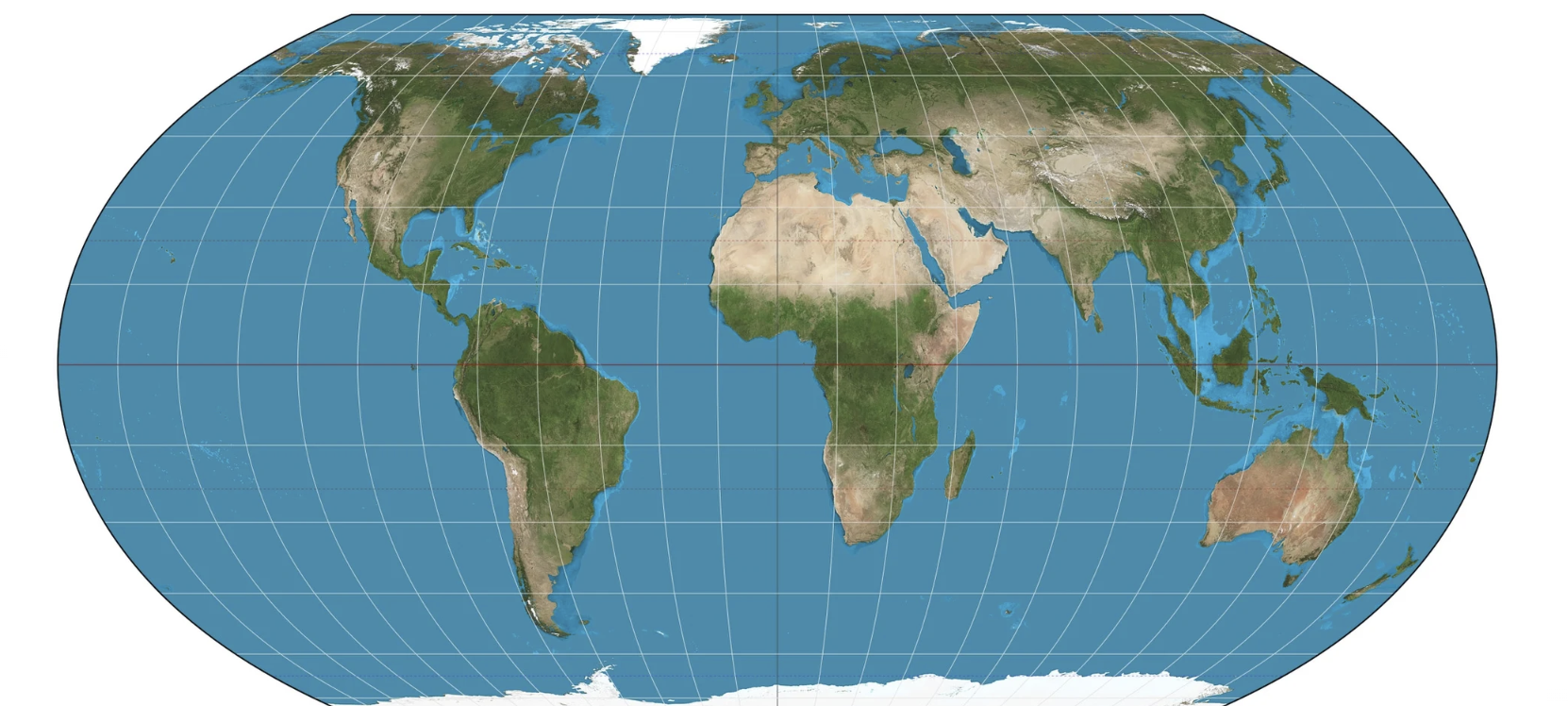
That image can be changed using the Office Picture Format tools, for example Color | Recolor | Grayscale or Corrections | Brightness/Contrast.
Other views from different longitudes
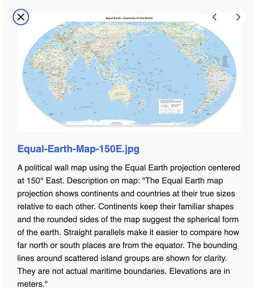
Search Wikimedia Commons for Equal Earth to find many images, including some centered on other longitudes instead of the usual 0° / Greenwich position.
This one is centered over Asia and Australia.

SVG versions of Equal Earth
We’re most interested in SVG versions of Equal Earth projection because of the editing options available. Office Watch has long championed SVGs for their easy editing.
SVGs are great because you get a proper vector map that scales, big or small, without blurring, in whichever projection you choose, with every country individually clickable. It’s also completely offline, so no privacy settings to fight.
In Wikimedia Commons, narrow the search to SVG files only of Equal Earth projections. There are many available but two caught our eye because the graphic isn’t a single image but is separated into countries or provinces within the country.
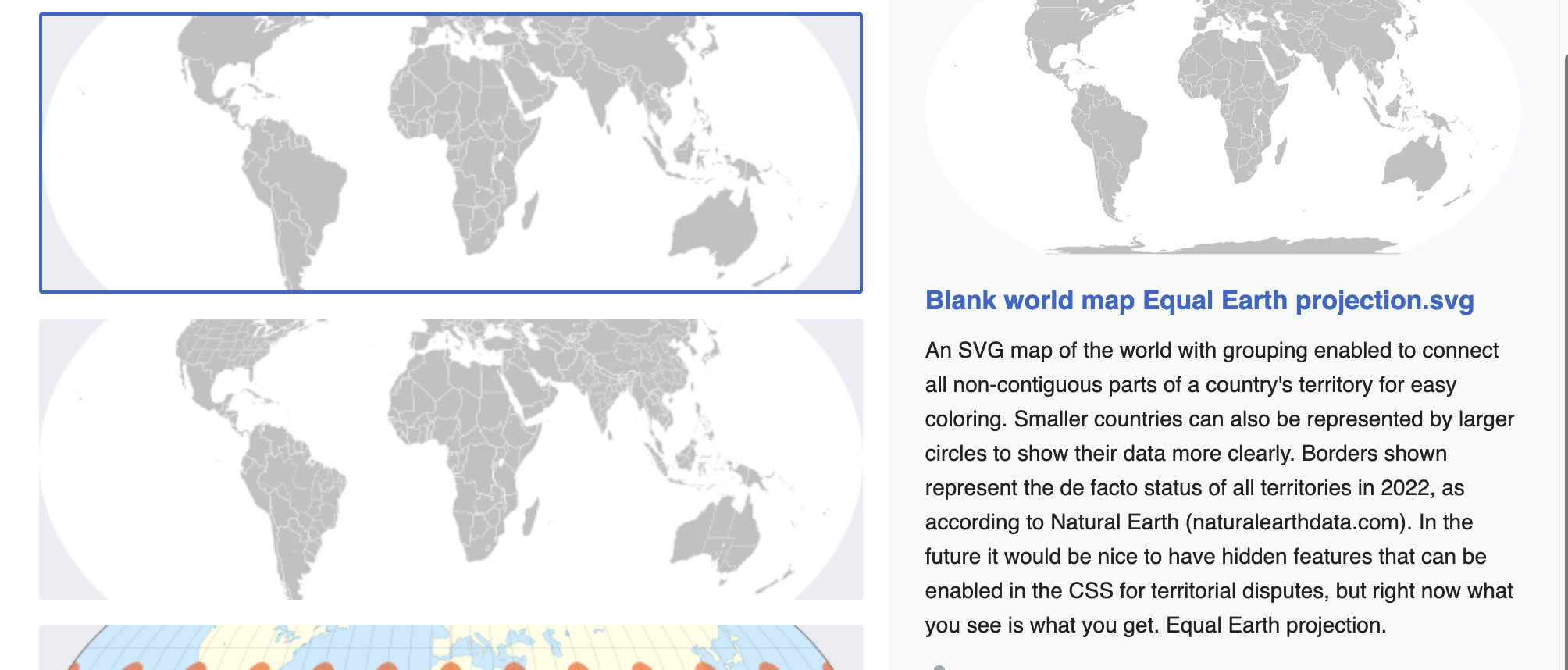
Blank world map Equal Earth projection.svg divides up into countries.

Blank world map with provinces Equal Earth projection.svg is the same but separates out states or provinces as well.

Change an SVG map inside Office
For any SVG in Word, PowerPoint or Excel – Windows desktop only:
- Insert | Pictures | This Device and choose the SVG file.
- Click the map, then on the Graphics Format tab choose Convert to Shape.
- Office breaks the map into individual shapes, one per country or province.
- Click any single country and fill it with whatever color you like.
Unfortunately, Microsoft’s convert SVG to Shape removes all the helpful tags to identify each country. Instead there’s a long list of “Freeform: Shape”.
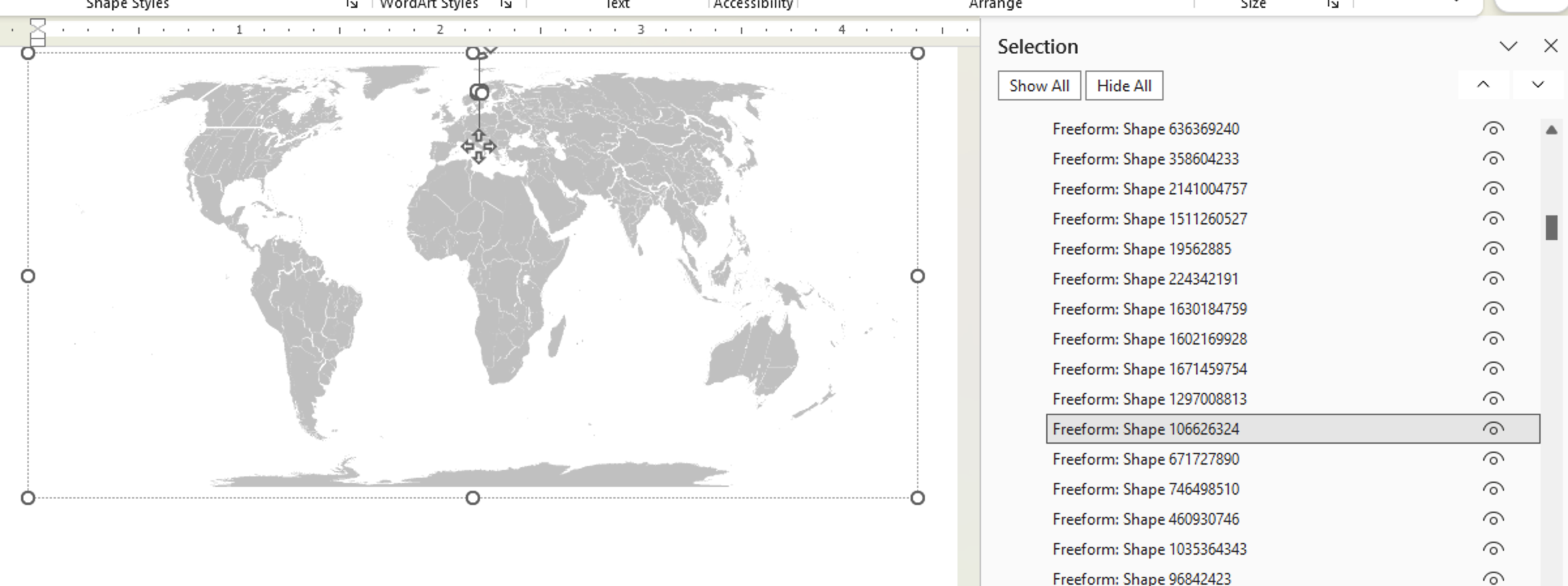
But you can click on the map to select a country then recolor or many other changes from the Shape Format ribbon including Fill and Outline.
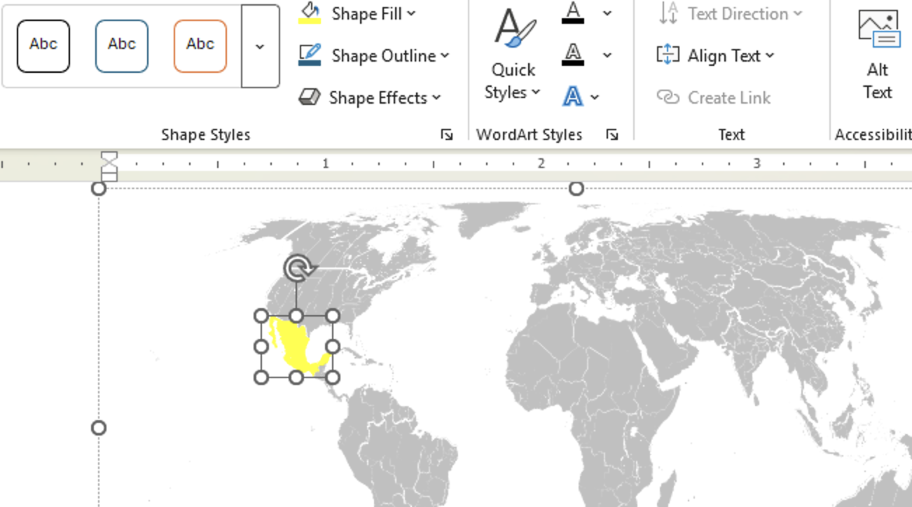
The downside is manual work. Coloring fifty countries by hand is tedious, and the shapes aren’t always labeled helpfully once converted.
Change the color or outline of a country
Another way to change the look is with any text editor like Notepad or Notepad++. This method is a little nerdy but very useful for bulk changes. A find and replace plus a few SVG or CSS tricks will do in seconds what takes an hour of clicking. It’s also the only option for Mac users because “Convert to Shape” isn’t available.
Here’s a quick example with Spain changed to red fill and Australia given a green outline.
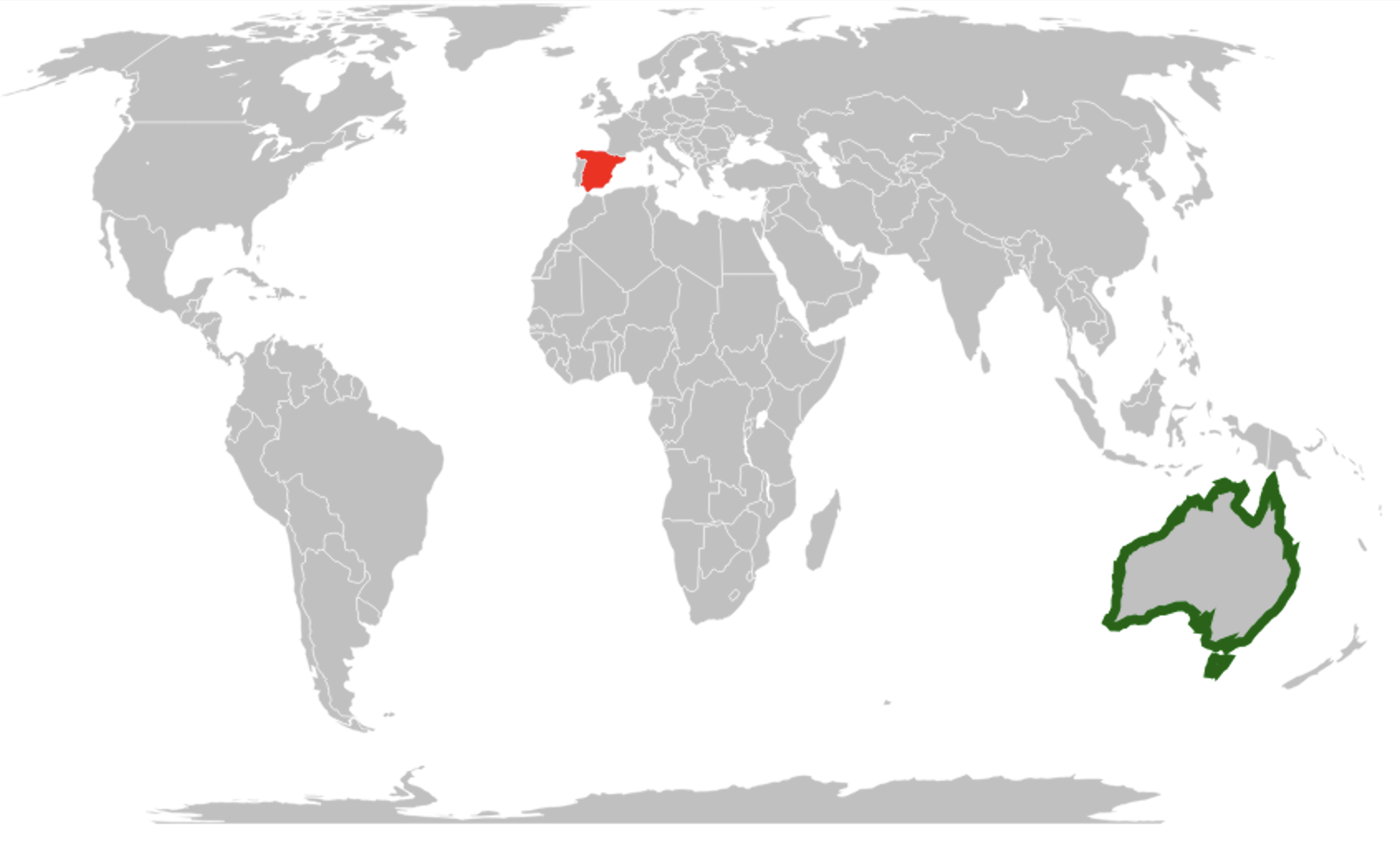
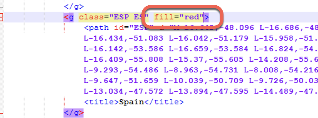
Open one of the two SVGs mentioned above in a text editor. Then search for the country. Above the country title is the ‘path’ that draws the outline for that area. In the <g … > tag above that, add the formatting you want.
<g class=”ESP ES” fill=”red”>
<g class=”AUS AU” stroke=”#006400″ stroke-width=”2“>
Get more map projections
Don’t like Equal Earth? No problem. Wikimedia Commons has public domain blank world maps in every projection you could want, including Mercator, Robinson, Winkel Tripel, Mollweide and Gall-Peters.
Search for them by name. The results can be filtered by type including SVG or JPEG.
Mercator vs Equal Earth
There’s no right answer. Any flat 2D rendering of the surface of a sphere is a compromise in some way. (Pedant note: the Earth isn’t a sphere, it’s an “oblate spheroid”)
The common Mercator projection is what most of us grew up with. Made in the 16th century, it became popular with sailors for navigation. But its linear scale means that land nearer the poles looks a lot larger than it really is. The common example of this is Greenland looking about the same size as Africa, which is 14 times bigger. Alaska looks about the same size as Australia, which is actually more than four times bigger..
There have been many attempts to make a fairer, more representative world map. Mercator, Miller, Albers and Robinson are available in Excel’s Map feature. Gall-Peters is another. Then there’s the 2018 Equal Earth projection that the UN resolution endorses.
What the UN resolution actually says
There’s been a sadly predictable reaction to the long-winded UN resolution. A few facts to keep in mind when reading reports and inflammatory social media comments.
Equal Earth is only preferred
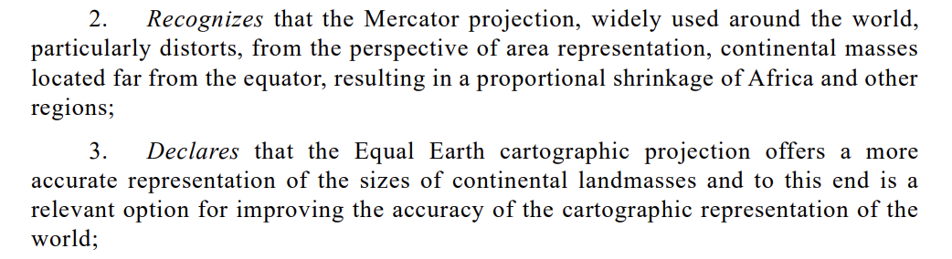
All the resolution does is state a preference for the Equal Earth projection over the Mercator projection.
The UN resolution is not binding on anyone
The resolution has no legal effect on individual countries; no UN resolution can do that. In this case, the UN decision only “encourages” adoption of the Equal Earth project.

More Ways to Bend Maps and Graphics to Your Will
The text editor trick used on the country fills here works on any SVG, not just maps. Edit SVG colors in Word, Excel and PowerPoint the Easy Way walks through the same technique on a simpler graphic, and Four SVG editing choices for Office 365/2019/2021 explains exactly why Convert to Shape produces that useless list of Freeform shapes.
If you would rather stay inside Office, there is more control available than most people realize. Better Icon, illustration or SVG editing trick in Office covers the gradient, texture and picture fills that only appear once a graphic becomes a Shape, while See more with Selection Pane in Excel, PowerPoint and Word is the fastest way to find and rename one country among two hundred.
For a different mapping job, Excel can shade countries automatically from your own data, though the results need supervision. Excel Map Charts are way overdue for fixes shows which settings to change first, and Quickly add continent maps to your Office documents is the one to read if you only need Europe, Africa or the Americas rather than the whole world.
Once your map looks right, you may need it in another format. Save Office images or slides to SVG format covers going the other way, out of Office, and Converting SVG into JPG, PNG or other raster image format is handy when a client or website insists on a plain image file.
Finally, if the recoloring in this article gave you ideas, Change a picture to a custom color in Office unlocks the same options for photos and JPEGs, and Finding more SVG or Icons for Office points to thousands more free vector graphics you can edit the same way.